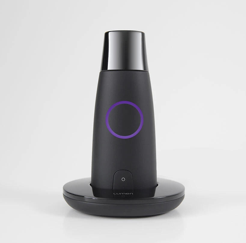
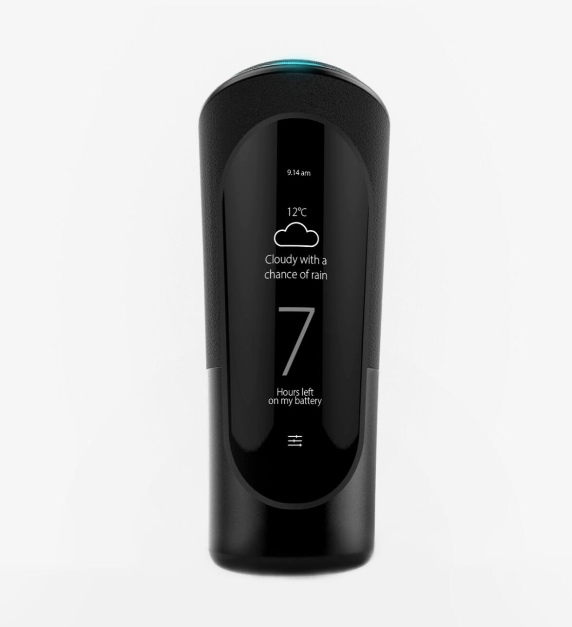


Lumen Health Tracker
ROLE
Industrial Designer as part of frog innovation team
FOCUS
Industrial Design · Concept Development · Ergonomics · Prototyping · CMF
COMPANY
Lumen Labs
IMPACT
Used by 300,000+ people worldwide
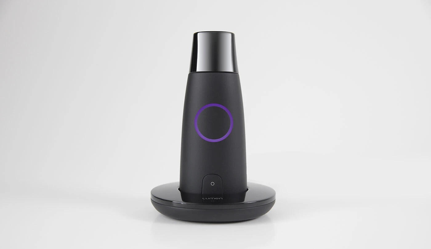
Lumen is a handheld metabolic tracker that measures carbon dioxide levels in a user's breath to determine whether their body is primarily burning carbohydrates or fat, translating complex metabolic data into simple daily guidance.
CHALLENGE
Designing Lumen required balancing scientific credibility with everyday usability. The device needed to house sensitive sensing technology while remaining approachable, portable, and intuitive enough for daily use. The interaction itself had to guide users through a precise breathing ritual without making the experience feel clinical or intimidating.
PROBLEM CONTEXT
Medical devices that require a breath hold aren't known for feeling approachable, and the mouthpiece, the measurement ritual, and the physical form all needed to feel considered rather than hospital-adjacent. The internal requirements pushed back hard: breath-flow path, sensor placement, and miniaturisation left limited freedom on what the form could do.
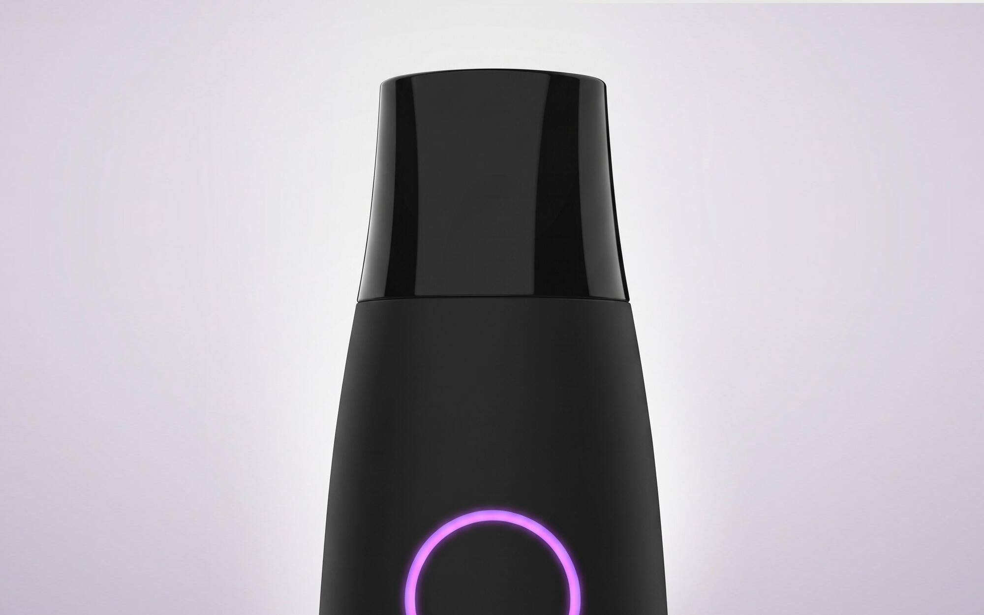
The device had to make a clinical measurement gesture feel like a daily ritual: ergonomic in one hand and small enough to carry
DESIGN GOAL
Design a handheld breath-analysis device that makes a clinical measurement gesture feel like a natural, daily ritual. The form must be ergonomic for single-handed use, seal reliably at the mouth for measurement accuracy, and be compact enough to carry without consideration while communicating consumer precision rather than medical utility. The device should not require the category to be explained by its appearance.
KEY CONSTRAINTS
· Precise airflow management
· Accurate sensor positioning
· Comfortable mouth contact
· One-handed operation
· Pocketable dimensions
· Consumer-friendly appearance
· Manufacturability at scale
CONCEPT EXPLORATION
The early phase involved developing a wide range of body concepts; varying grip geometry, mouthpiece integration approaches, and overall proportions to test how different forms held up against the breath-flow path and sensor placement requirements. Concept development started with sketching, variants were developed in Rhino.
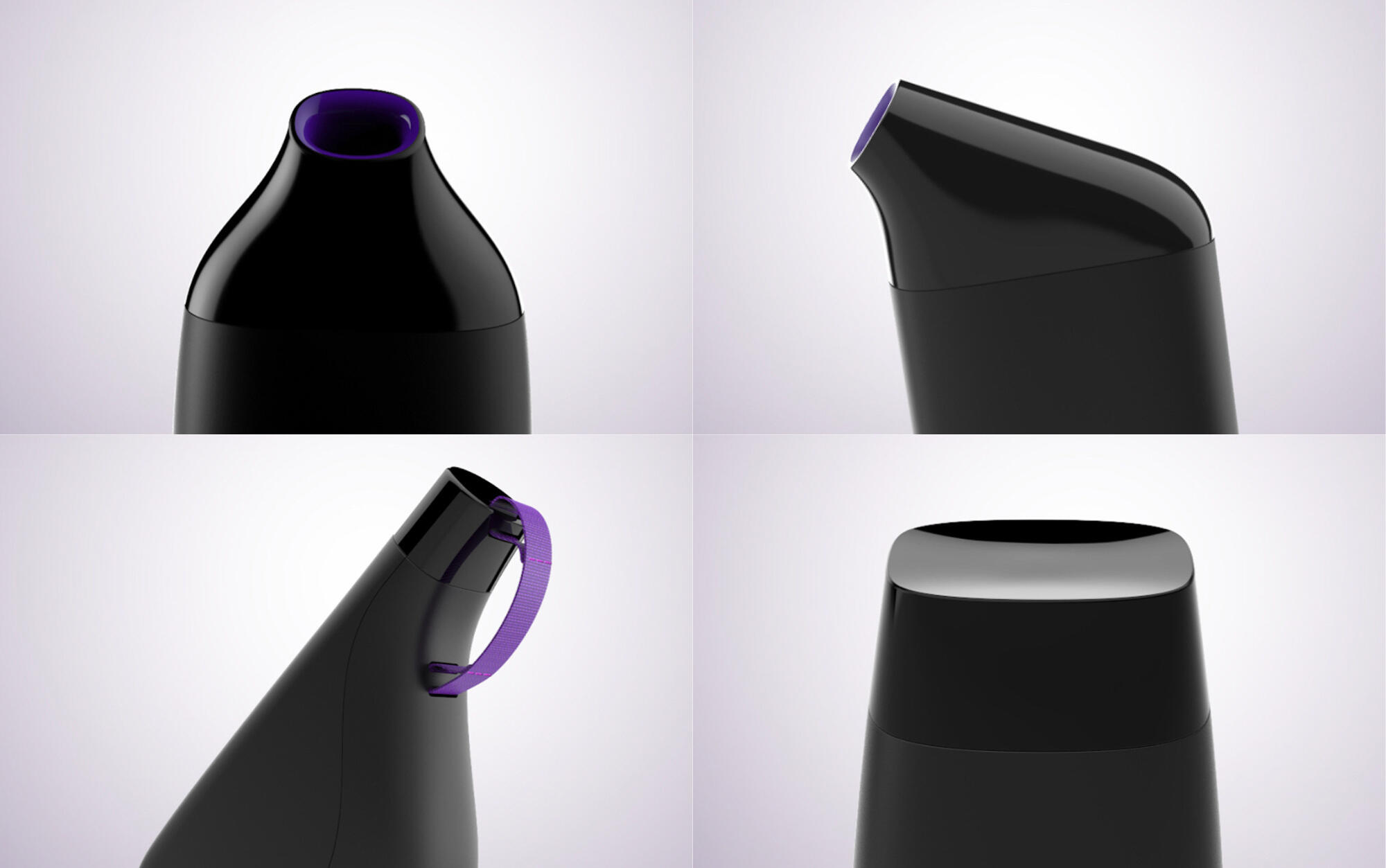
The early ideation tested a wide range of form directions
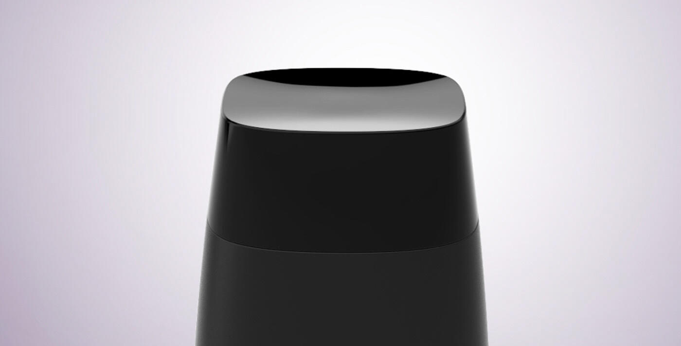
Dir. 1: The concave cap variant explored protecting the mouthpiece between uses without a moving part that could collect residue or fail over time
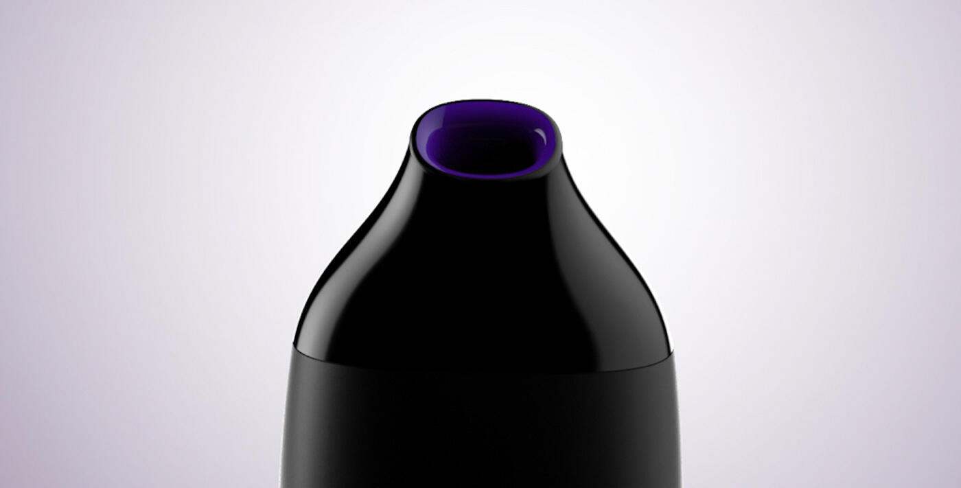
Dir. 2: The centered circular opening on this variant was explored to test a neutral, symmetric breath-hold; no preferred angle, no directional bias
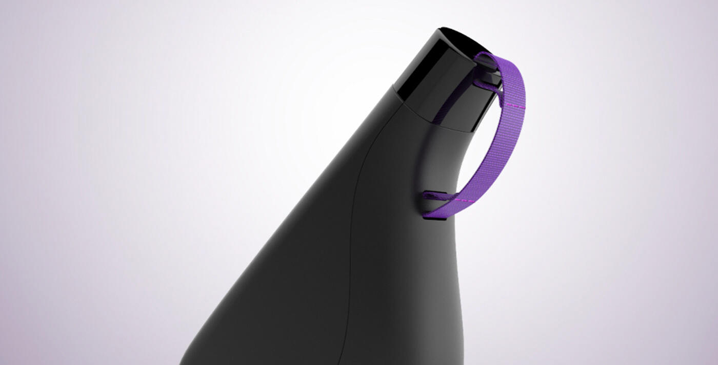
Dir. 3: The loop provides a reliable grip point for one-handed retrieval and doubles as a subtle personalisation detail
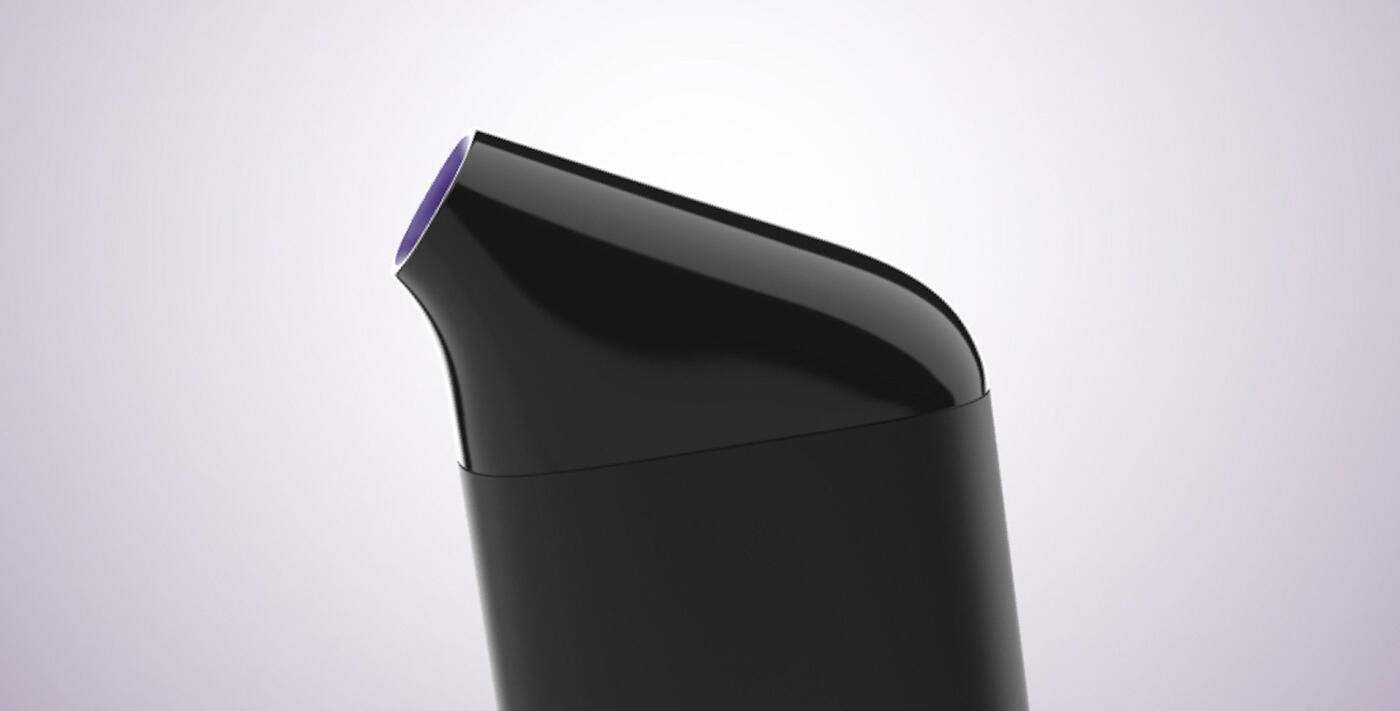
Dir. 4: An angled mouthpiece allows the breath-hold geometry to be in a more natural wrist position
ITERATIVE PROTOTYPING
Successive prototypes were evaluated to optimize airflow pathways, internal packaging requirements, and user interaction details while maintaining a compact footprint. Refined ergonomics around the specific constraint of a breath hold: the user's posture and mouth position are fixed during a scan, so grip stability and thumb placement had to work without active adjustment.
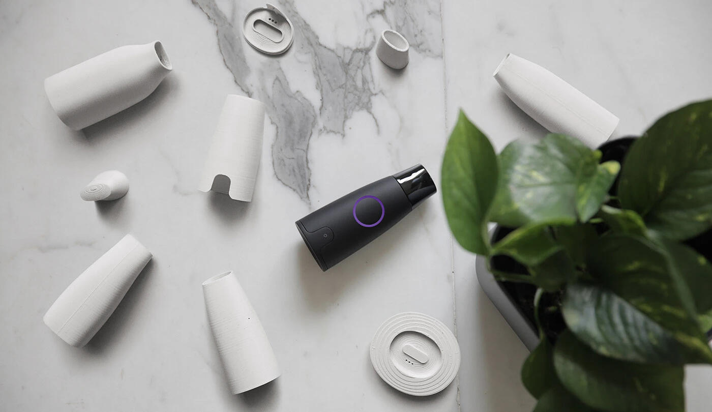
Multiple 3D printed prototypes were tested to validate ergonomics in hand, checking how the grip felt during an actual breath hold where posture and mouth position are fixed.
CMF DEVELOPMENT
CMF was directed to position Lumen within premium consumer wellness rather than clinical hardware or consumer electronics. Materials, textures, and finishes were selected to communicate reliability and precision while supporting frequent daily handling. The housing is matte-painted PC/ABS, soft enough to read as wellness, not sterile enough to perform as medical.
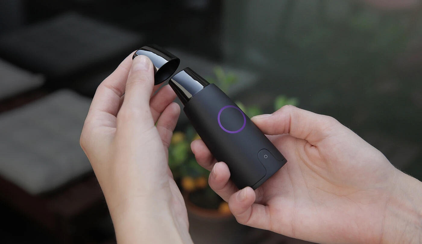
CMF direction to position Lumen within premium consumer wellness, drawing on surface and material language from that category
KEY FOCUS AREAS
· Translating breath-flow requirements into form decisions, the path air takes through the device isn't invisible, and the housing has to accommodate it without the form feeling dictated by it.· Ergonomics of a single-handed grip during a breath hold, where the user's posture and mouth position are fixed.
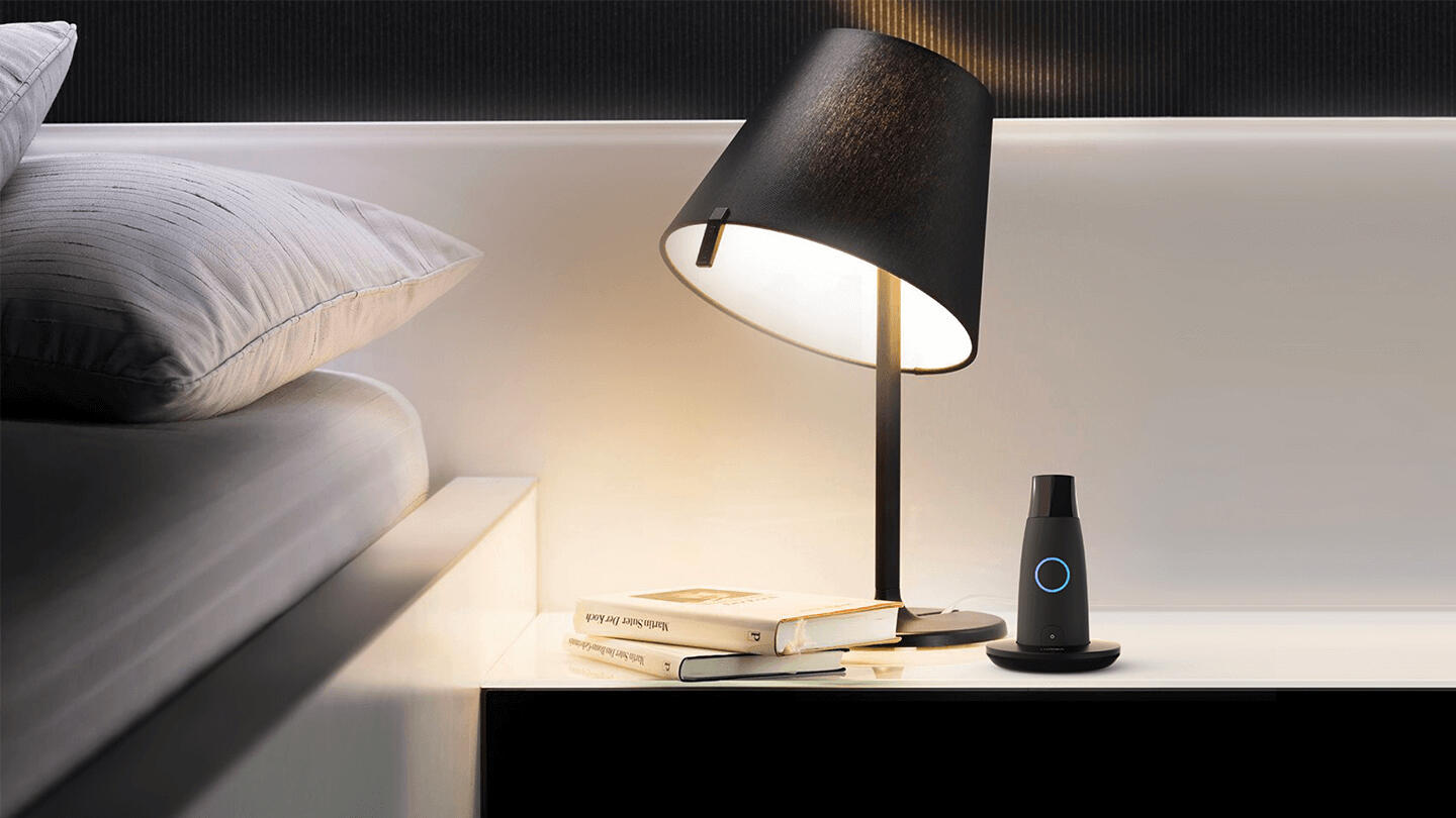
Lumen is designed to discreetly fit in context without appearing like a medical device
• Mouthpiece design: the seal matters for measurement accuracy, but it also has to feel clean and comfortable at repeated daily use.• Making the overall scale work; small enough to be portable, substantial enough to feel precise.• Surface language and materiality that positions it as a consumer device rather than clinical hardware.
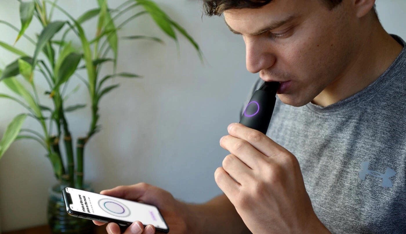
Production-ready design integrating sensing technology into a compact handheld device
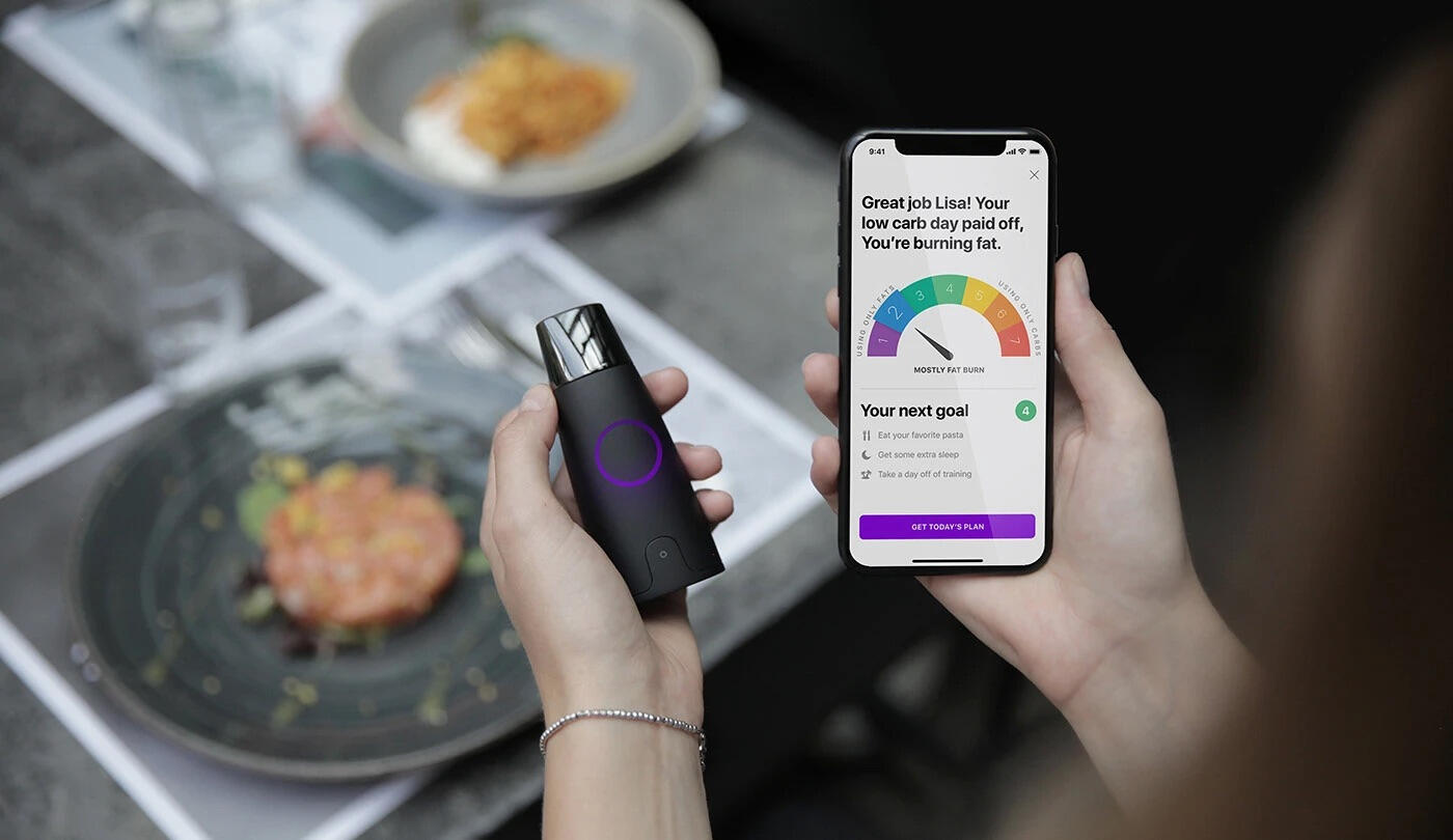
Our team that handled the industrial design worked together with the software team to ensure holistic user experience
OUTCOME
Lumen successfully launched as a consumer health product and has since been adopted by more than 300,000 users worldwide. The project demonstrates how thoughtful industrial design can transform a technically complex measurement process into a simple and engaging daily ritual.
ROLE
Industrial Designer as part of frog innovation team
FOCUS
Industrial Design · Concept Development · Ergonomics · Prototyping · CMF
COMPANY
Lumen Labs
IMPACT
Used by 300,000+ people worldwide
Halo Beard Trimmer
ROLE
Industrial Designer
FOCUS
Industrial Design · CMF · Concept Development
COMPANY
Self-initiated
IMPACT
A' Design Award Silver Winner
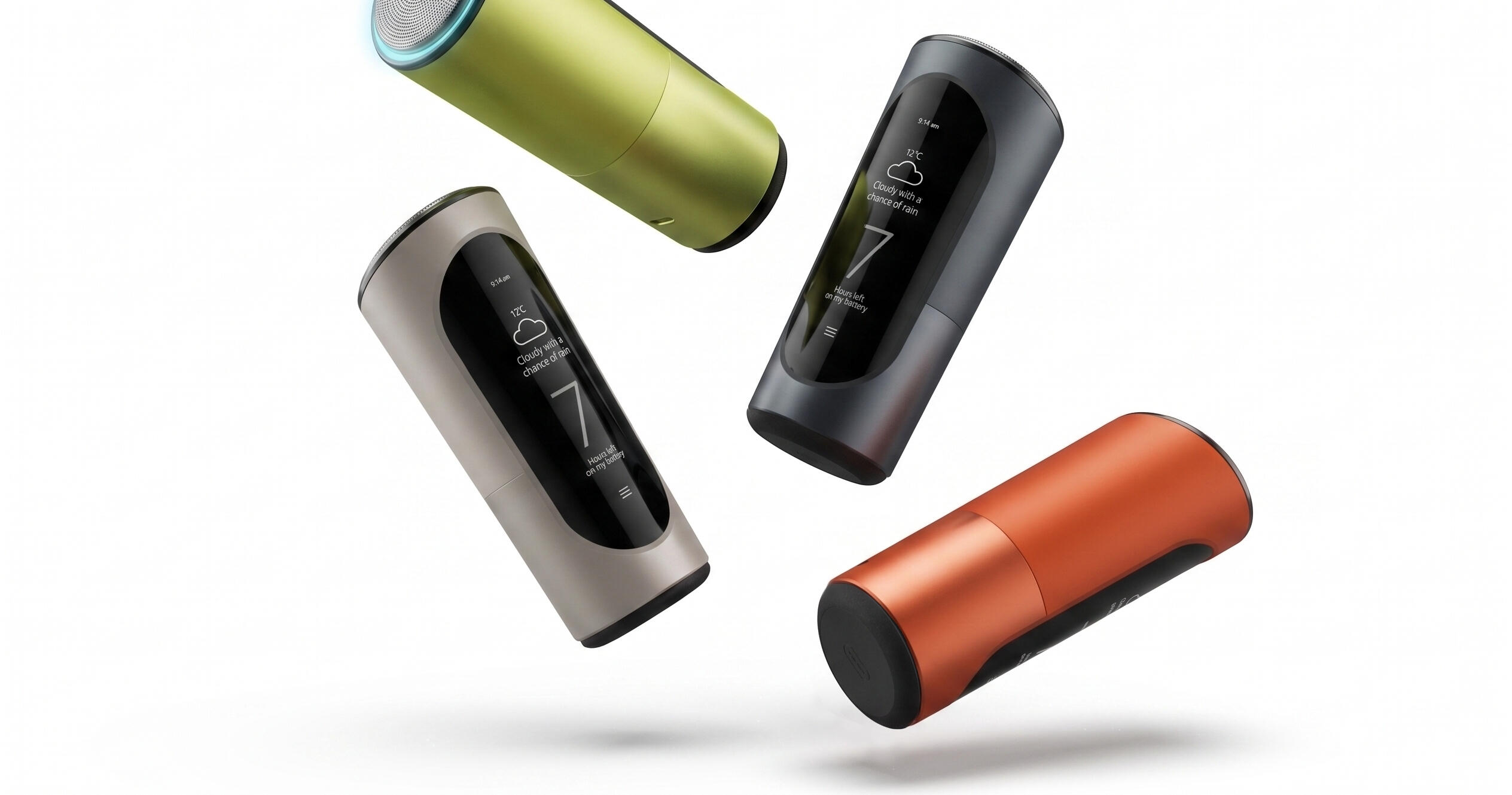
Halo is a smart electric shaver and trimmer concept I designed at my studio. The project explored what a next-generation personal grooming device could look like if the hardware adapted to the user rather than requiring the user to compensate for the hardware's limitations. It received an A' Design Award and was published on Yanko Design.
PROBLEM CONTEXT
Electric shavers are designed around averages. Every face has different geometry, and shaving well across jaw angles, the upper lip, or the neck typically means going over the same areas repeatedly to compensate for what the device can't resolve on its own. The result is more passes, more irritation, and no real feedback about whether technique or tool is the limiting factor.
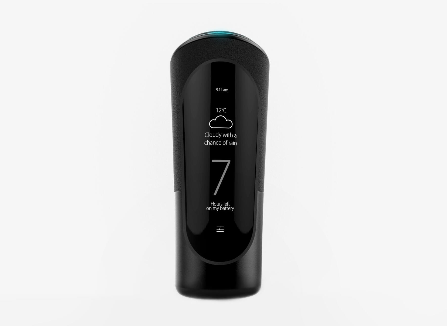
The front face is a single uninterrupted surface. All the functions; the display, the the scroll wheel sits within it rather than on it
DESIGN GOAL
To design a beard trimming device that uses gyroscopic sensors to map the contours of an individual face over time and adjust head rotation and blade force accordingly, removing the need to work around the device. The concept also needed to function as a precision trimmer, with a scroll-wheel length selector built into the same form.
VISUAL INSPIRATION
The reference direction drew from precision instruments and premium bathroom hardware rather than the consumer electronics category that most grooming devices aspire to. The intent was an object that reads as considered and specific.
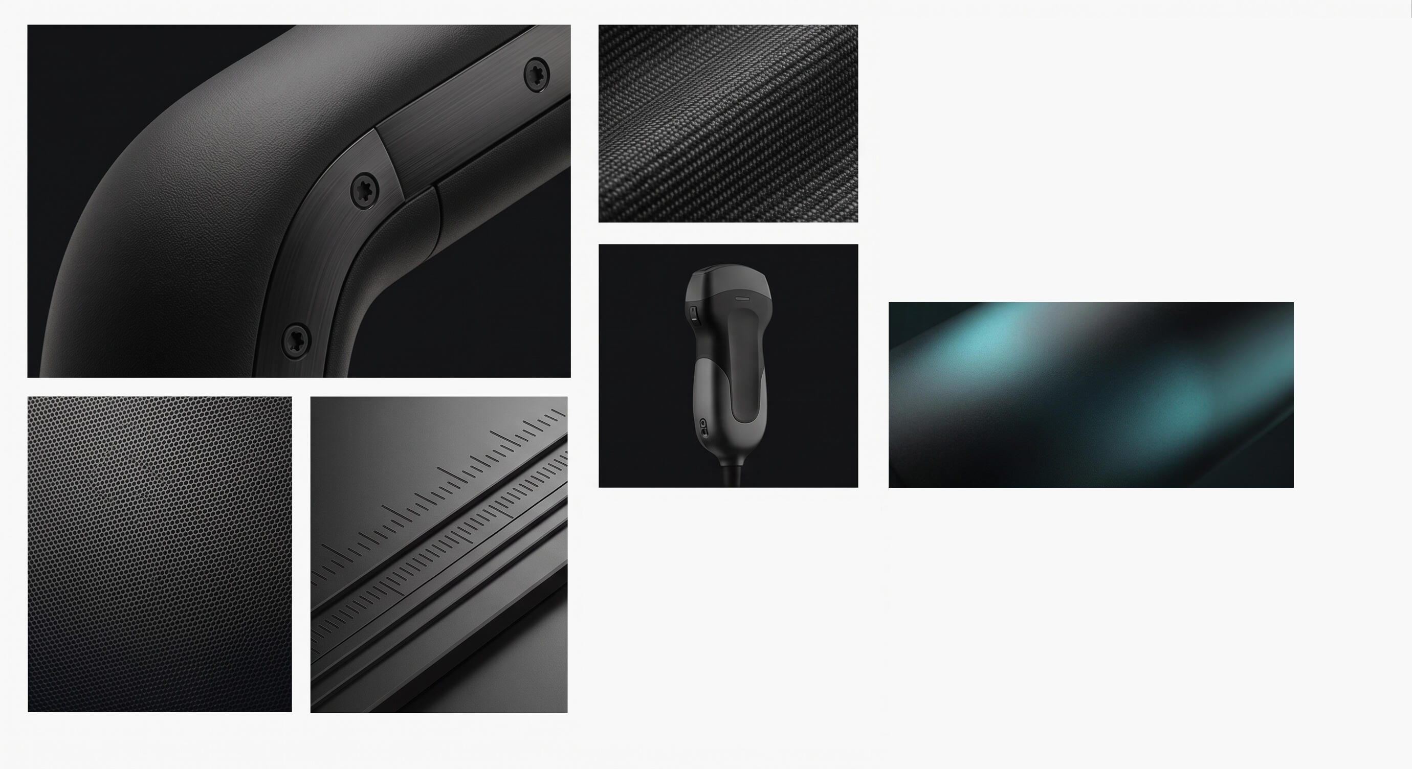
Surface transitions, material contrast between the gloss face and matte grip zones, and the teal crown detail were all informed by the inspiration moodboard
ITERATIVE DEVELOPMENT
Early structural and form prototypes were built to validate design. At this stage the priority was proportions, not finish. The prototypes tested how the grip profile felt across wrist orientations, and whether the scroll wheel placement worked in practice during a trimming gesture. Several grip profiles were tested before the final taper and interface point were confirmed.
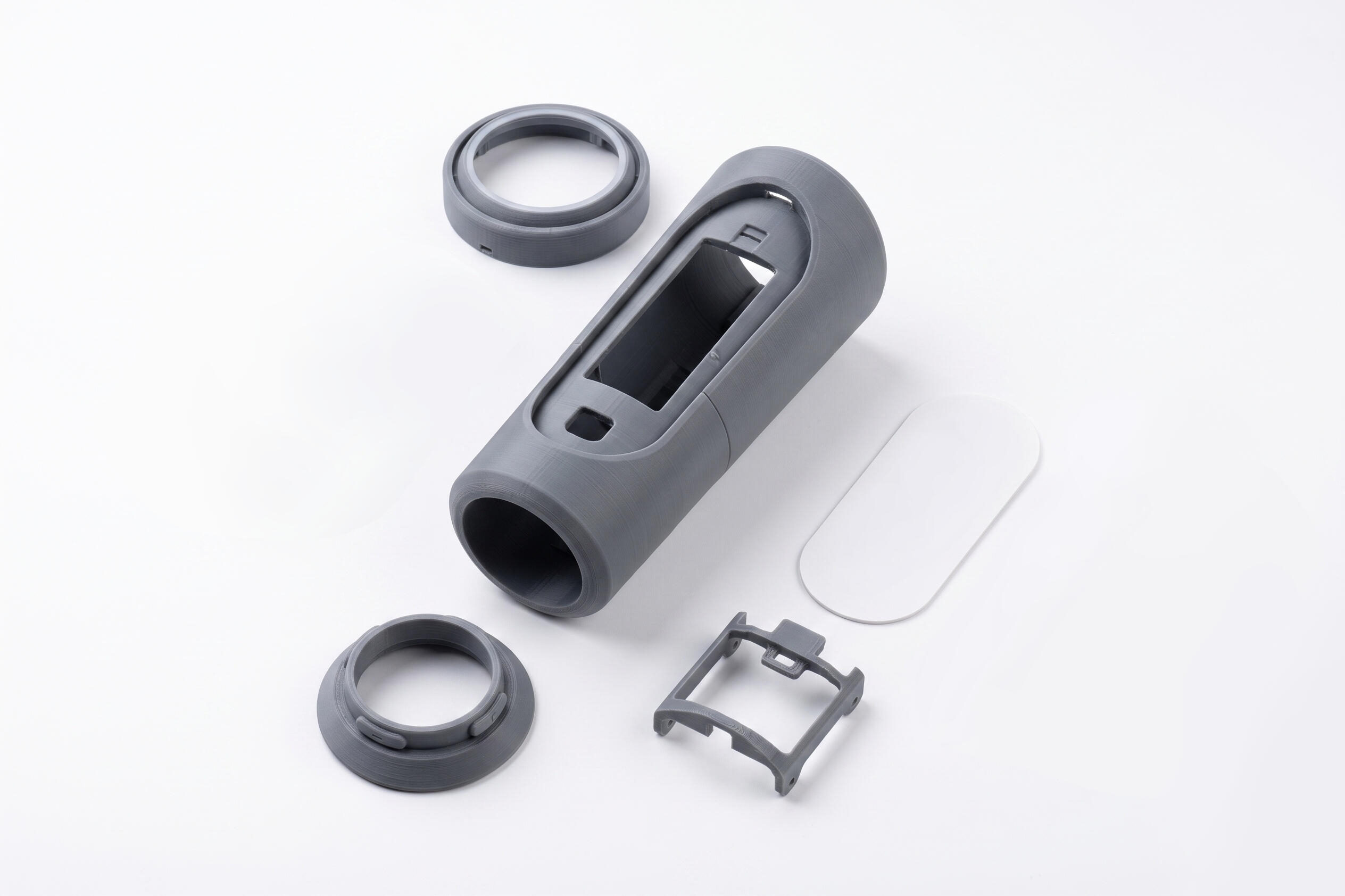
Early structural prototypes used to validate the ergonomics and proportion before surface development began
PRODUCT ARCHITECTURE
Ergonomics were worked across multiple grip positions and angles, since a shaver moves through a range of wrist orientations during use and has to feel stable in all of them. The trimmer function and length-control wheel were resolved into the same form rather than treated as a secondary attachment; the goal was a single coherent object, not an everyday item with a display attached on it.
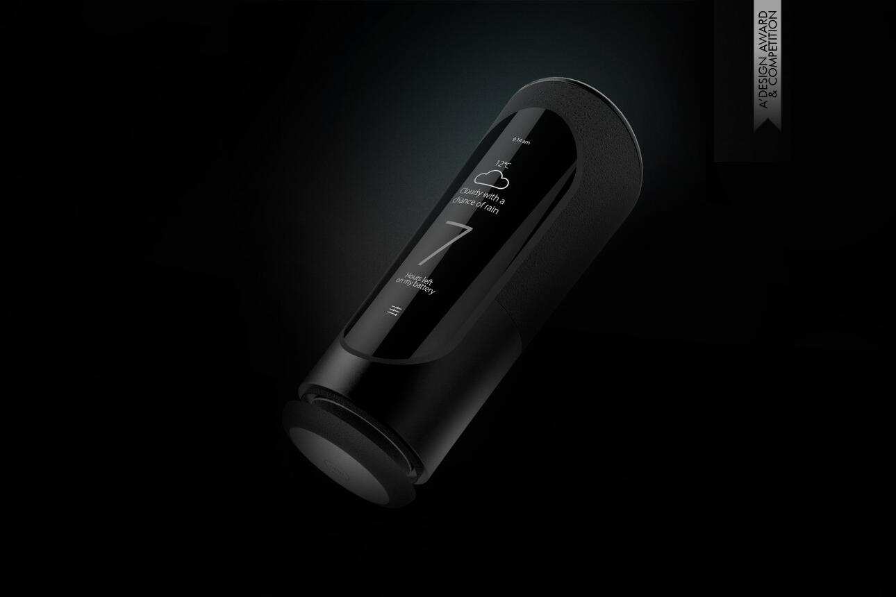
Halo received the A' Design Award Silver in the Electronic Devices and Technology Design category
The central formal challenge was the shaving head. It had to communicate movement and adaptability without looking overengineered or aggressive; a fine line in a category where most devices either read as blunt utility or overcomplicated technology. The head needed to suggest precision through its geometry rather than through exposed mechanism.
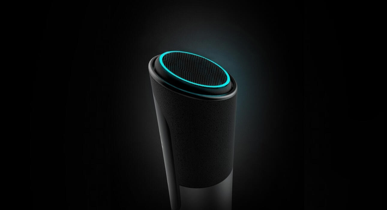
The shaving head is the formal centre of the device. The geometry had to suggest movement and adaptability through its proportions
CMF was treated as a positioning decision as much as a finish one. The front face in high-gloss PC/ABS with polished-tool finish reads as premium at the point of sale and holds up in a bathroom environment. The grip zones are two-shot overmoulded in TPE with a fine-grain texture achieved in-tool, providing tactile differentiation from the gloss shell without a secondary assembly step. The curved display lens in formed PMMA sits proud of the housing surface, and the teal LED ring at the crown is diffused through a frosted PC light guide. The base cap is moulded separately in a matte finish consistent with the grip zone texture, completing the object without adding visual noise.
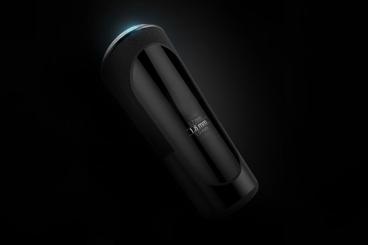
The display sits within the grip zone which keeps the device's centre of gravity low and the screen readable and interactable without repositioning the hand during use
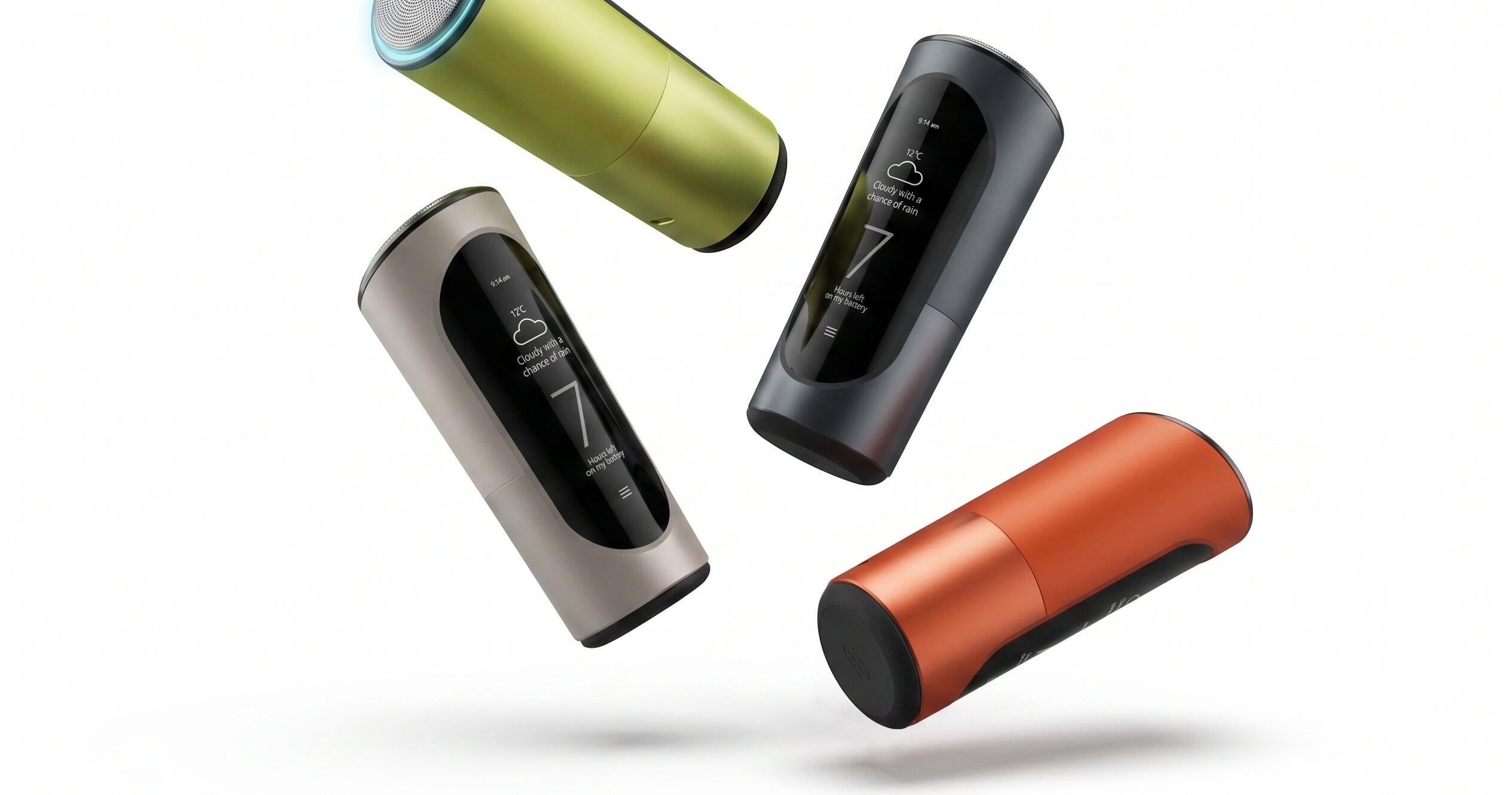
Same form reads differently across the colorway range; the metallics position it closer to premium grooming, the darker tones toward mature, the terracotta toward a younger market. The structure doesn't change; the audience does
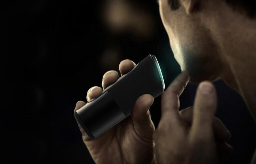
The grip has to remain stable through continuous wrist rotation. Most of the ergonomic work happened here
OUTCOME
Halo was recognised with an A' Design Award and published on Yanko Design. As a self-initiated concept, it was an exercise in designing sensor-driven adaptive hardware for a category that had been formally stagnant for a long time.
ROLE
Industrial Designer
FOCUS
Industrial Design · CMF · Concept Development
COMPANY
Self-initiated
IMPACT
A' Design Award Silver Winner
Scanz Skin Scanner
ROLE
Industrial Designer as part of frog innovation team
FOCUS
Industrial Design · Ergonomics · CMF · Form Development
COMPANY
mySkin
IMPACT
$8 million raised
ScanZ is a handheld skin diagnostic device developed by mySkin, a funded startup building a spectroscopy and dermoscopy platform initially focused on acne tracking. They came to frog for the industrial design concept of the device. I was the industrial designer on the project.
PROBLEM CONTEXT
ScanZ is clinically derived, the intended use is managing acne at home. That creates a specific positioning problem: the device has to make direct skin contact at close range to read accurately, which means it has to be held steadily against the face, one-handed, while connected to a phone. Getting that gesture to feel natural was the central ergonomic constraint. The form also had to land in personal care, not medical hardware; for a consumer at a consumer price point, how the object reads matters as much as how it functions.
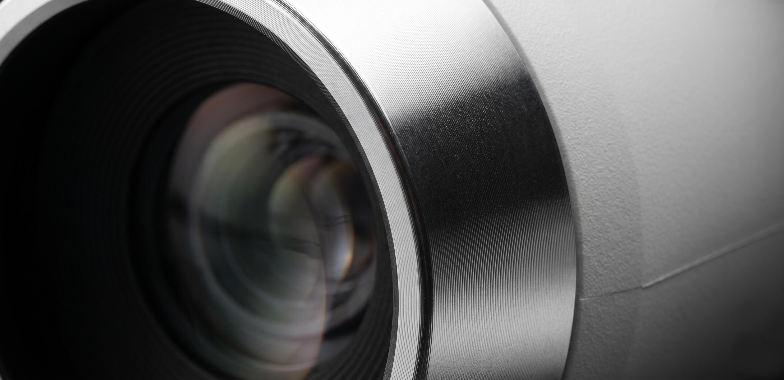
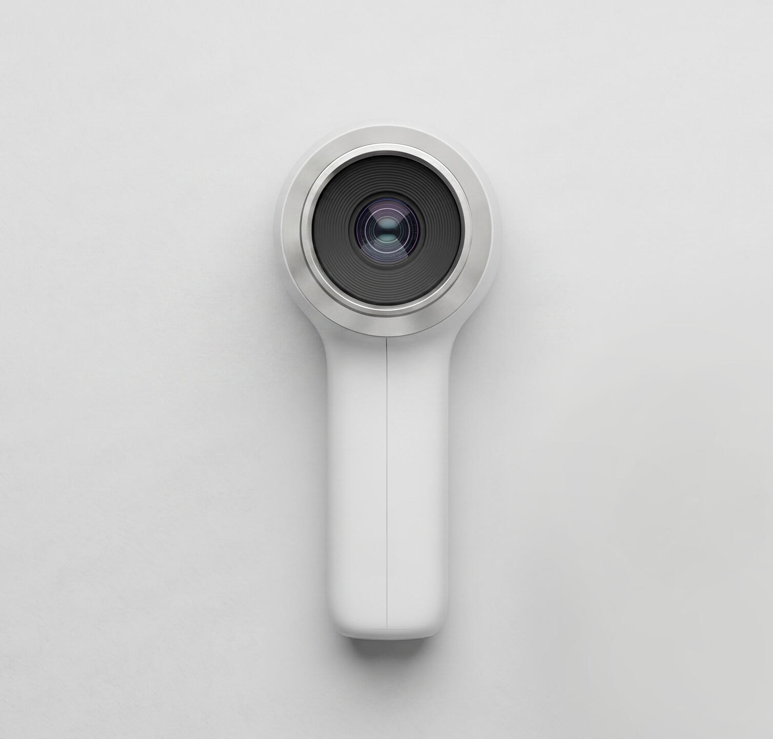
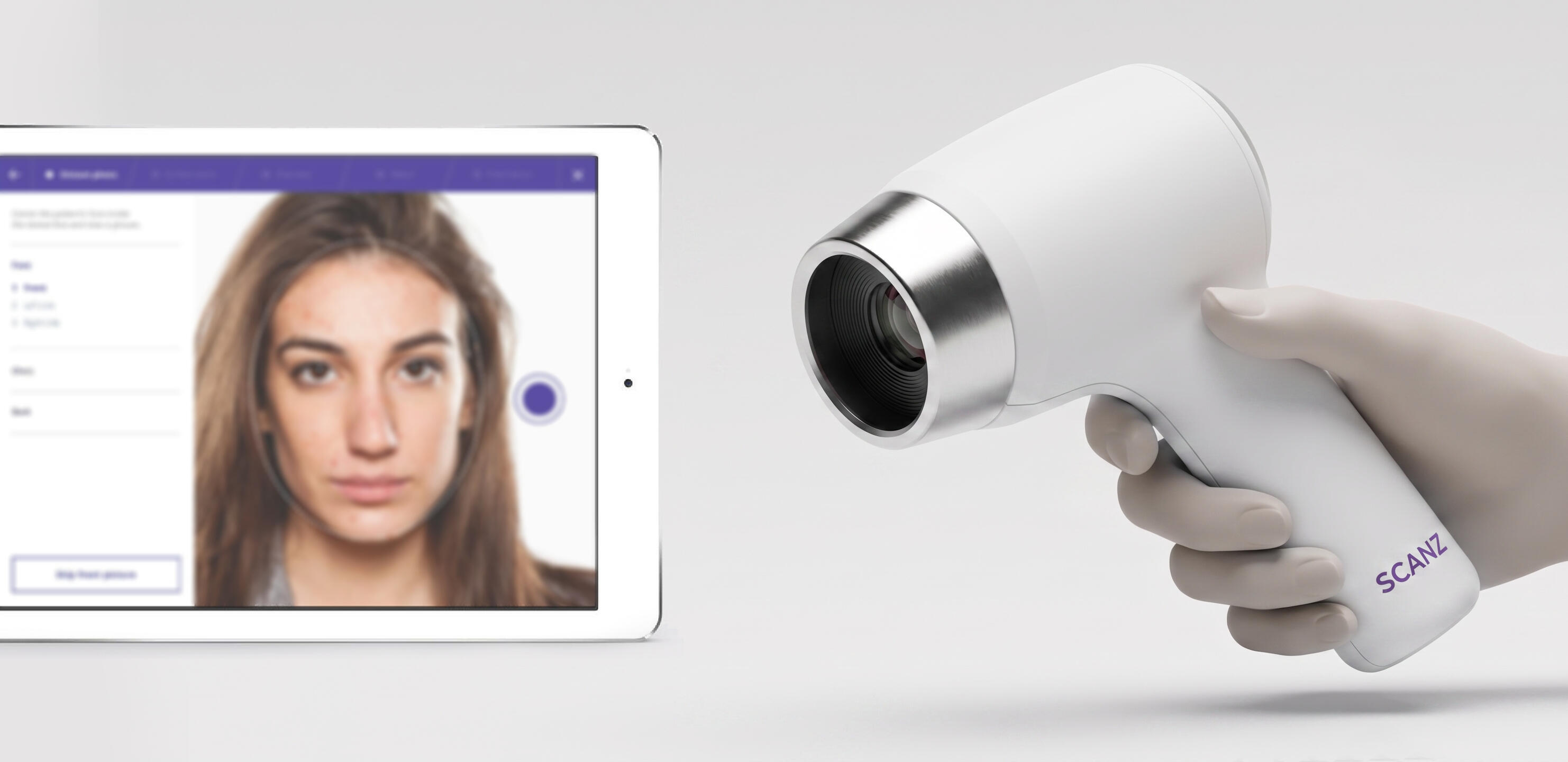
Material contrast at the scanning head: the medical grade stainless steel against the matte housing marks the transition
DESIGN PRINCIPLES
· Make the scanning gesture intuitive
· Balance scientific credibility with approachability
· Integrate optical hardware into a coherent form
· Create a product that belongs in a bathroom rather than a clinic
KEY CONSTRAINTS
· Stable one-handed operation
· Accurate skin contact positioning
· Accommodation of optical hardware
· Consumer-friendly appearance
· Compact handheld footprint
· Clear visual relationship between optics and interaction area
My role as industrial designer at frog on the ScanZ project was concept generation, form development, ergonomic refinement, CMF direction, and visualisation of the resolved concept. The deliverable was a defined ID concept rather than a production-ready design for business validation.
DESIGN PROCESS
Concept development through to a resolved ID direction: form exploration, ergonomic refinement, and CMF. We worked closely with the wider design team to translate technical requirements into a product experience suitable for everyday consumer use.
VISUAL INSPIRATION
The visual direction drew inspiration from contemporary personal-care products, optical instruments, and premium consumer electronics. Particular attention was given to surface transitions, proportions, material expression, and the balance between technical credibility and everyday usability.
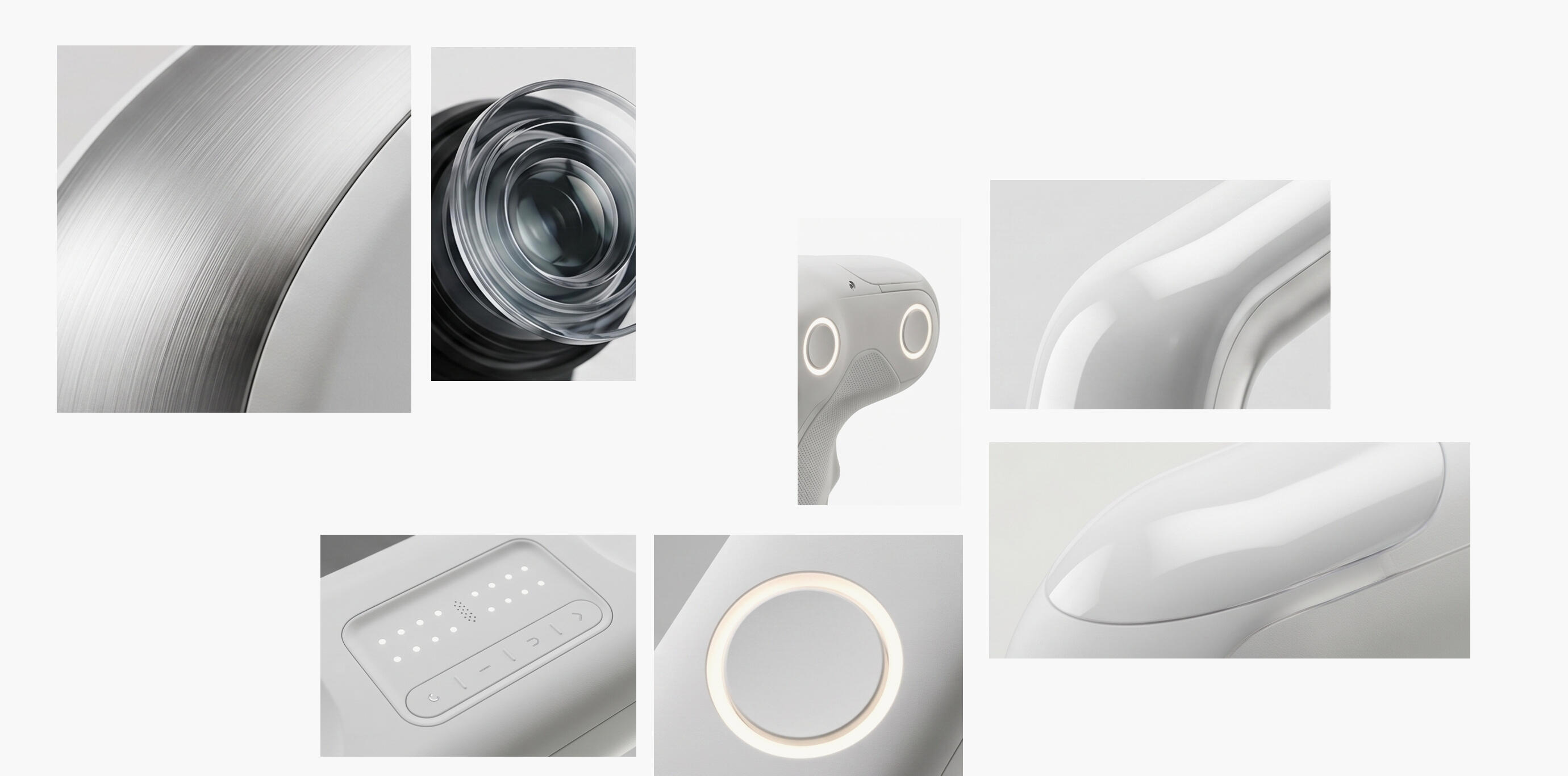
The visual direction was established before form development began: an object that belongs in a bathroom and reads as capable without reading as clinical
FORM EXPLORATION
Early ideation was done digitally on Wacom, which allowed rapid iteration through form directions without the overhead of physical model-making at that stage. Proportions, junction angles, and grip profiles could be tested and discarded quickly. Early exploration focused on resolving the challenging L-shaped architecture created by the optical system.
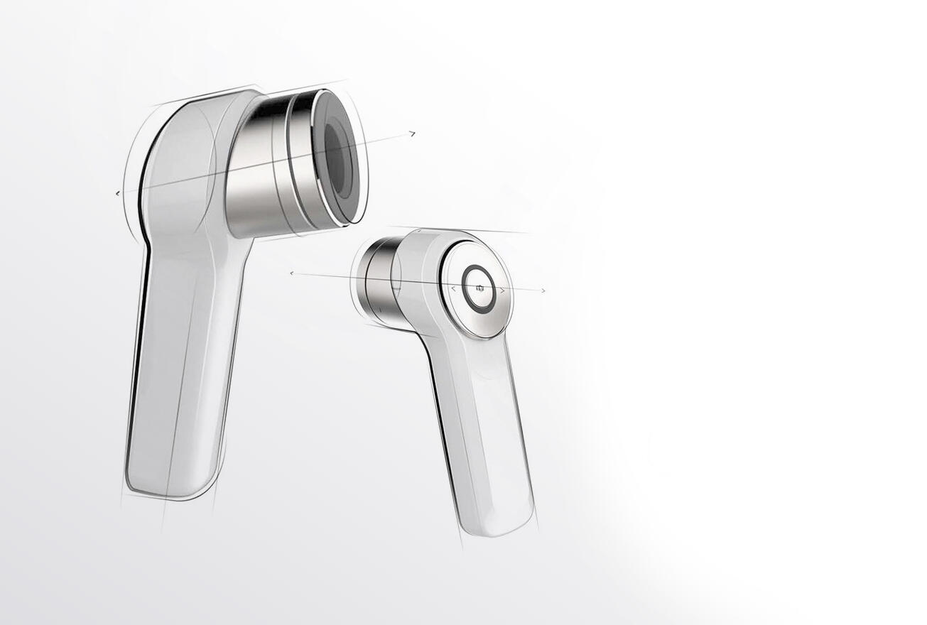
Investigating relationships between grip geometry, user interface and optical-head integration
Once a direction had enough resolution to be worth validating physically, the geometry moved into 3D-printed prototypes sized and weighted to approximate the final device. These were tested across multiple hand sizes and grip configurations to understand how the handle profile performed in practice.
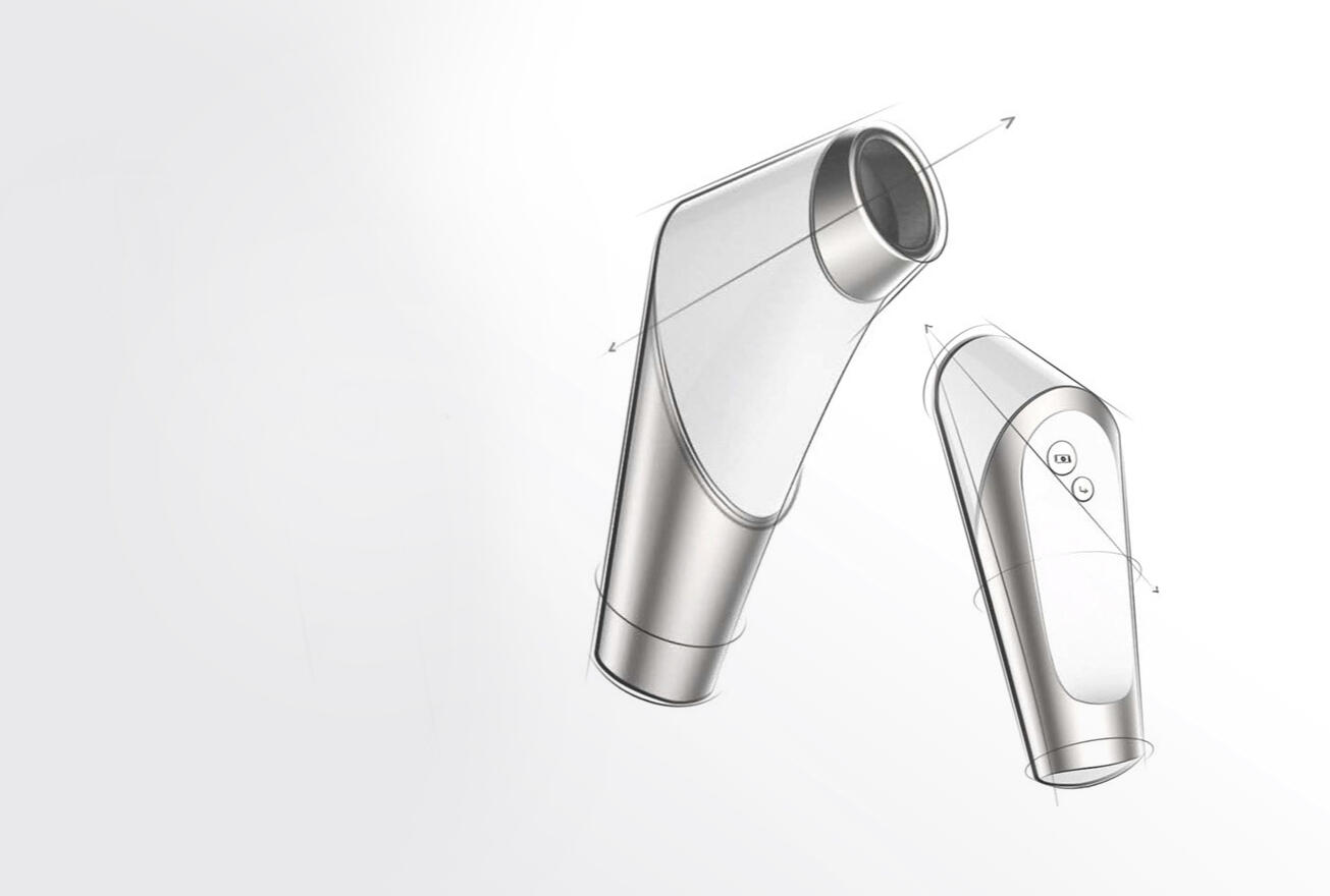
Numerous form directions investigated how the scanning head and handle could become a coherent object rather than appearing as separate components joined together
ERGONOMIC DEVELOPMENT
Because the device is used directly against the face, comfort and stability became primary design drivers. Multiple variations explored handle geometry, grip profile, and scanning-head orientation to create a gesture that felt natural and repeatable during everyday use.
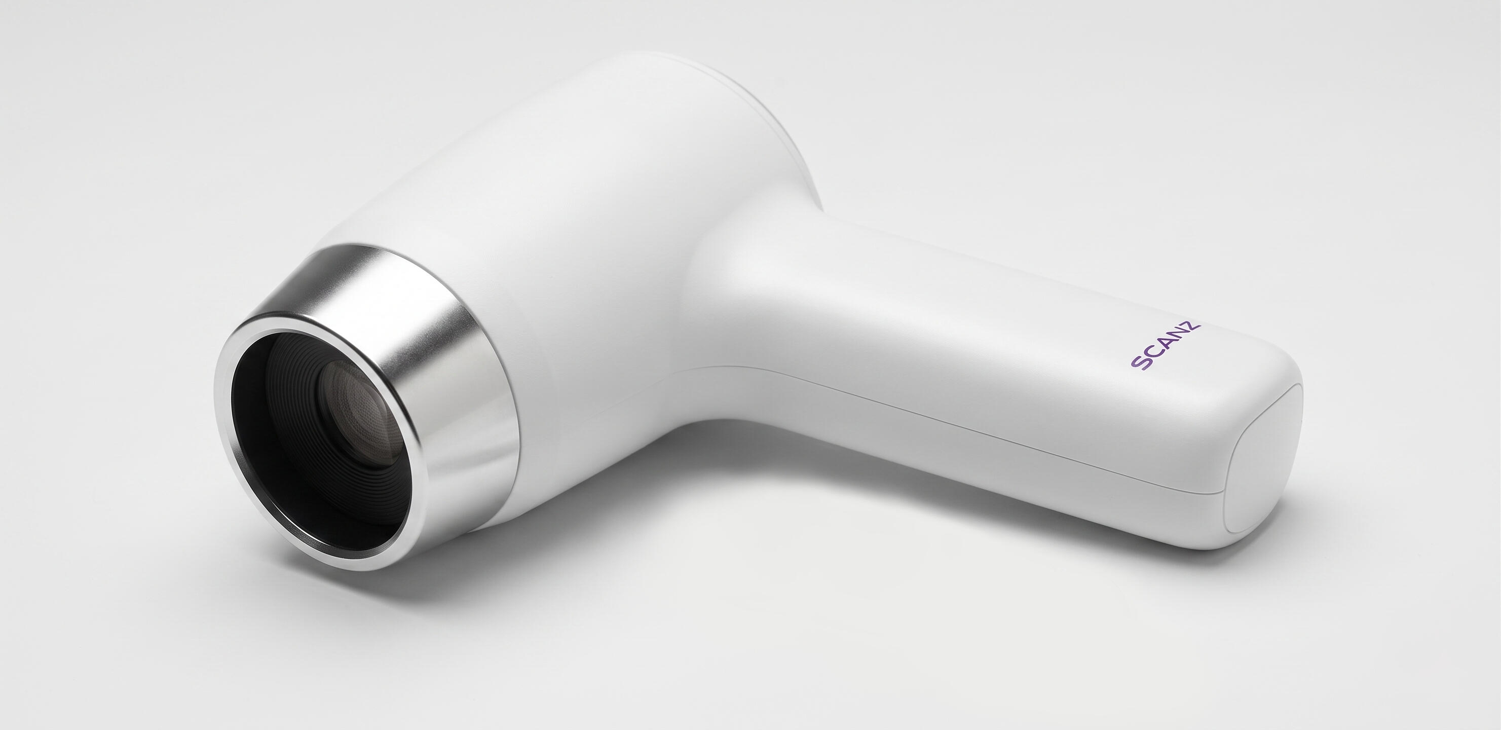
Resolved industrial design direction communicated through KeyShot visualisations.
VISUAL INTEGRATION
Particular attention was given to how the optical components were expressed. Rather than hiding the technology completely or exposing it as engineering hardware, the design frames the optics as an intentional feature that communicates capability without appearing clinical.
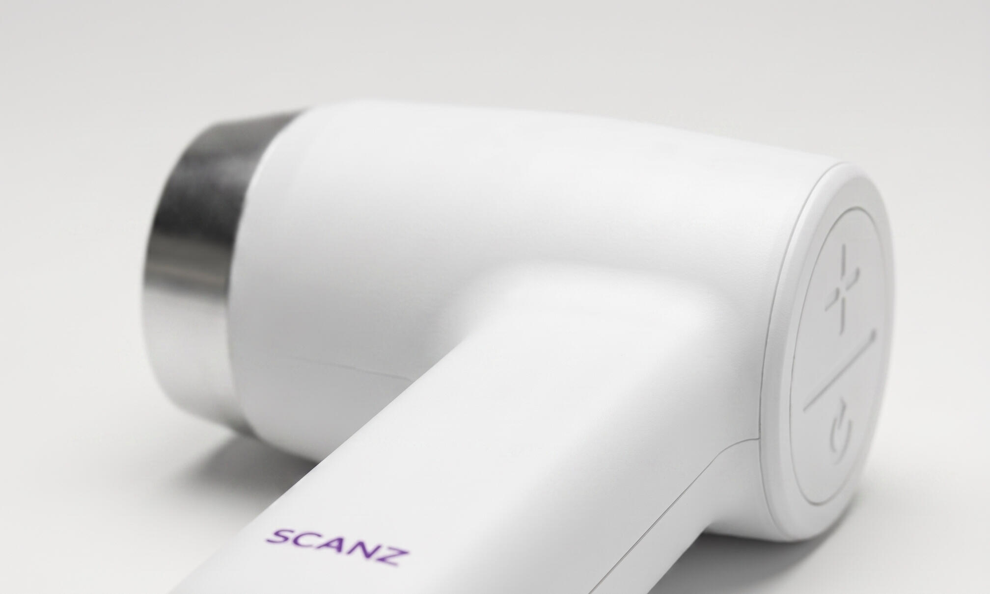
The button placement on the rear cap keeps interaction away from the scanning face, so the hand gesture of holding the device against skin doesn't interfere with the controls
CMF DEVELOPMENT
CMF was directed to land the device firmly in personal care rather than medical hardware or consumer electronics. The housing is matte-painted PC/ABS in soft white; the matte finish reduces visual weight and keeps it out of clinical territory without pushing it toward the hard-gloss language of consumer tech. The lens collar in polished turned aluminium provides the single premium material contrast, framing the optical assembly as the functional centre of the object.
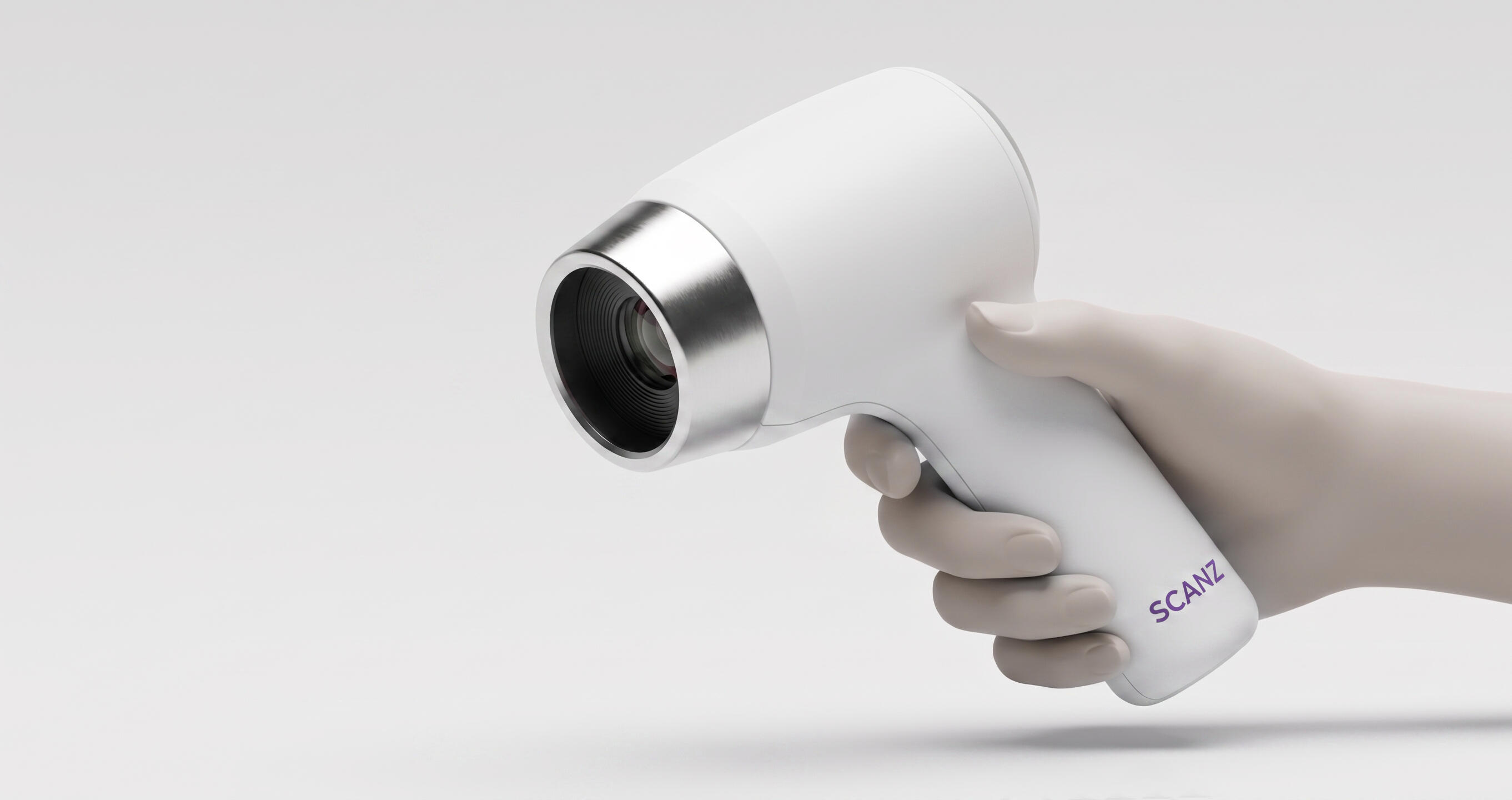
Ergonomic refinement focused on the face-contact gesture: thumb support, contact angle, and scanning stability across the range of hand sizes the device would need to accommodate
KEY FOCUS AREAS
• Ergonomics of a skin-contact scanning gesture; one-handed, face-held, repeatable across different users• Form integration of the optical head and contact surface without the device reading as clinical
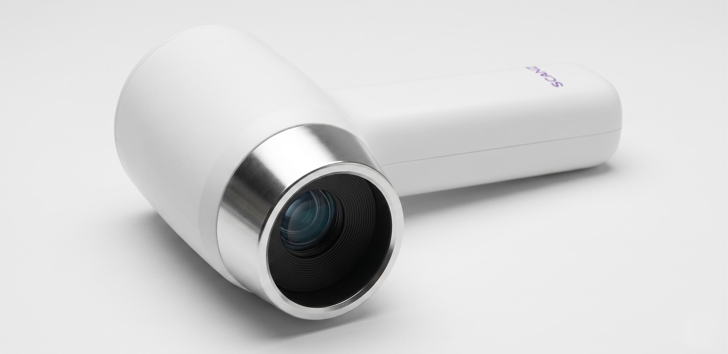
Framing the optics as a feature rather than hiding was the key visual integration decision
• CMF positioning within personal care at a realistic consumer price point• Resolved form language that makes the optics feel like a considered design element rather than an engineering exposure
The resolved direction positions ScanZ within personal care through restraint: matte white housing, restrained technical material combination and a simple logotype
OUTCOME
The project established a clear industrial design direction for mySkin's consumer diagnostic platform, demonstrating how clinically derived sensing technology could be translated into a personal-care product experience. Concept delivered at the right stage of a startup's development is more useful than a production-ready design delivered too early. ScanZ needed a direction it could take to investors and a stage before engineering constraints were fully defined.
ROLE
Industrial Designer as part of frog innovation team
FOCUS
Industrial Design · Ergonomics · CMF · Form Development
COMPANY
mySkin
IMPACT
$8 million raised

SuperSonic Ultrasound
ROLE
Industrial Designer as part of frog innovation team
FOCUS
Industrial Design · Human Factors · Product Architecture · Interaction Design
COMPANY
SuperSonic Imagine
IMPACT
Successful launch of the Aixplorer Mach 30 platform
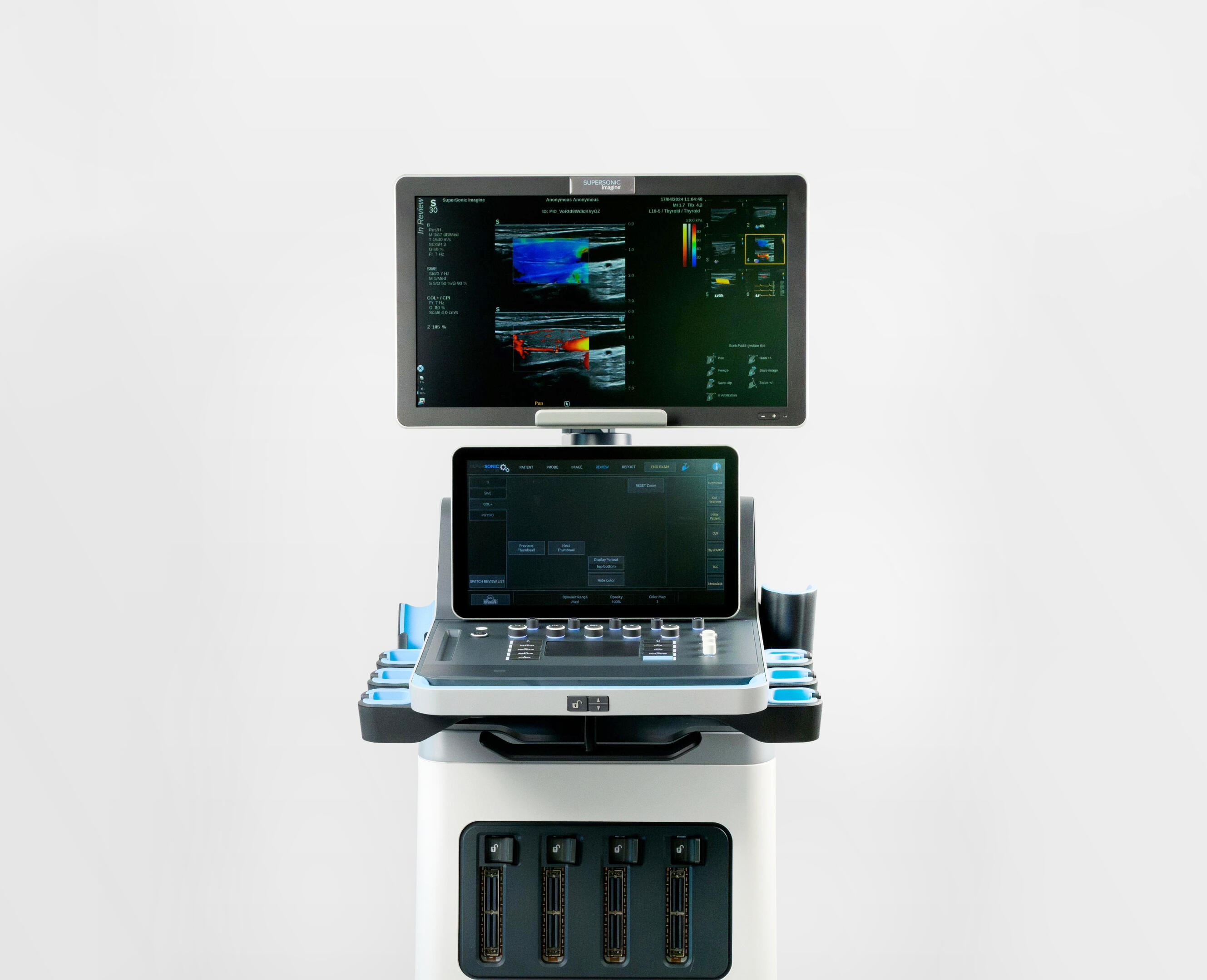
SuperSonic Imagine is a medical imaging company specialising in ultrasound technology. I was part of the industrial design team, working on the physical form, interaction model, and prototyping programme at frog. Scope was to redesign their flagship platform, a project that ran from user research through to launch of the Aixplorer Mach 30.
PROBLEM CONTEXT
Conventional ultrasound systems carry significant legacy in their form factor. Rows of knobs, buttons, and trackballs made sense when processing happened at the hardware level, but now create friction in how clinicians actually work. During a scan, a sonographer's attention should be on the patient and the image. Instead it's split between interpreting what they're seeing and navigating physical controls that weren't designed around that workflow. In fast clinical settings, that split attention has real consequences.
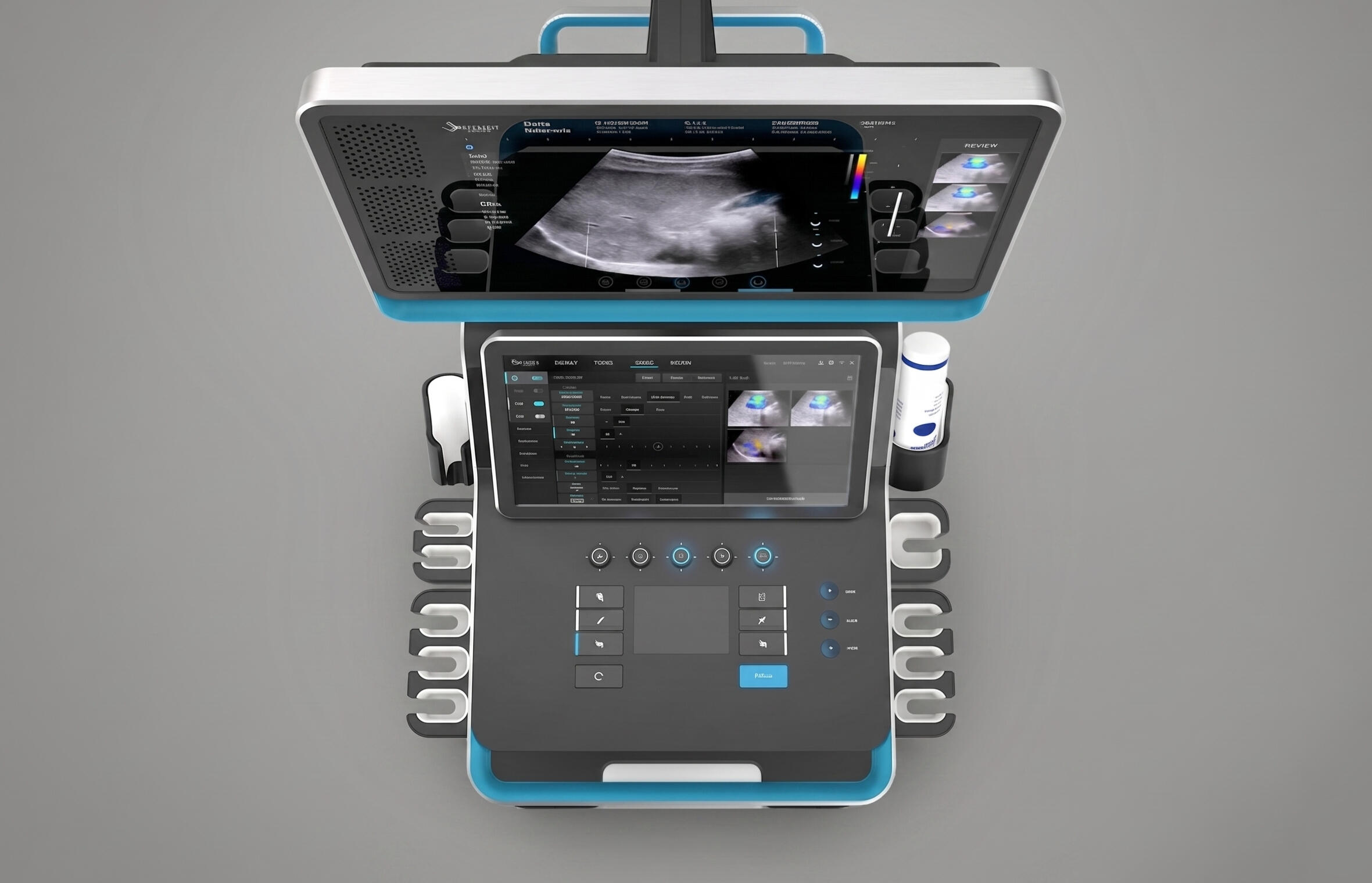
The starting point was to design a control surface designed around hardware-level processing as the technology beneath it evolved
DESIGN GOAL
To rethink the control paradigm so that interaction with the system feels continuous with the diagnostic act, not separate from it. That meant moving from trackball conventions to a multi-touch surface that integrates physical controls into a single, more fluid interaction model.
KEY CONSTRAINTS
· Compliance with medical-device regulations
· Existing clinical workflows and habits
· Integration of multi-touch interactions
· Long operating sessions and ergonomic requirements
· Hardware packaging and serviceability
· High reliability expectations in clinical environments
My role as industrial designer embedded in a multidisciplinary frog team alongside engineers and clinical stakeholders, working across physical form, interaction model, and system architecture. The engagement ran from initial user research through to implementation support at launch, nearly four years in total.
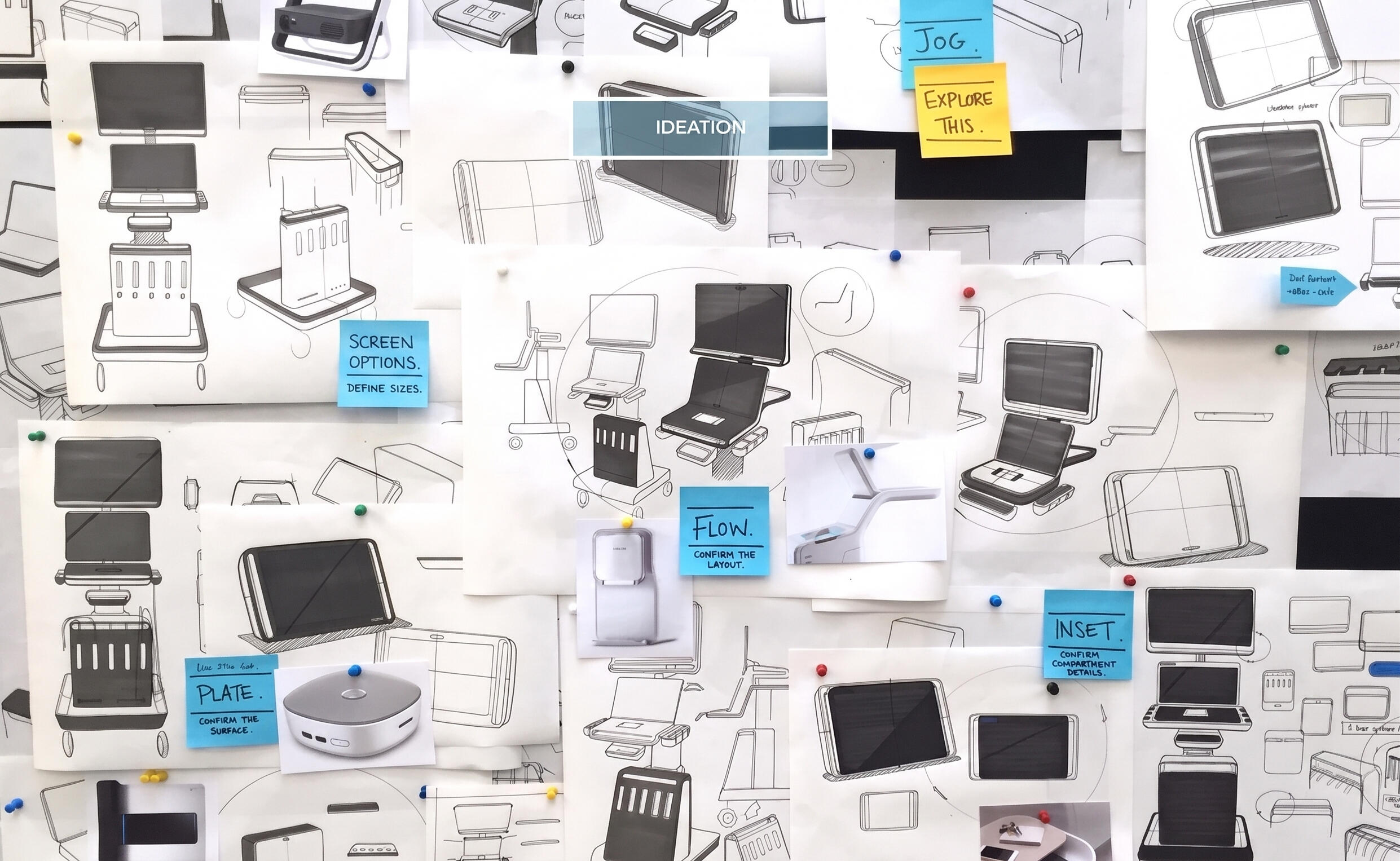
Early investigations into system architecture, screen positioning, and control strategies
PROTOTYPING
The full-scale prototypes were used to test the design language, validate hardware integration, and assess user workflow in realistic conditions including how sonographers moved between the SonicPad, the touchscreen, and the patient across a real exam sequence.
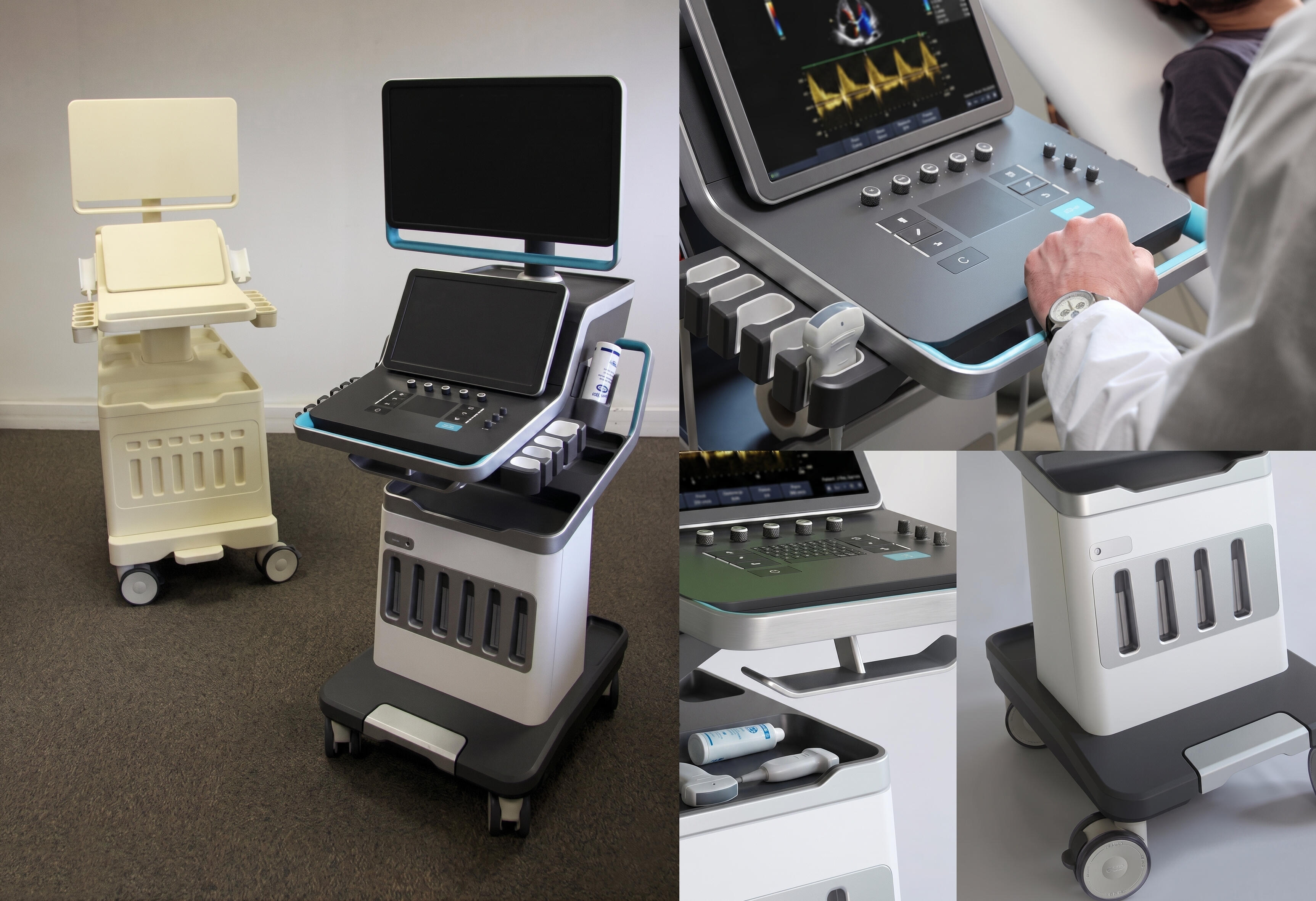
Full-scale prototype in a realistic clinical setting; the only valid way to assess ergonomics, reach distances, and workflow integration at the size of a clinical workstation
INTERACTION DESIGN
Rather than treating hardware and software as separate layers, the system was designed as a unified interaction experience where touch surfaces, physical controls, and on-screen feedback work together seamlessly.
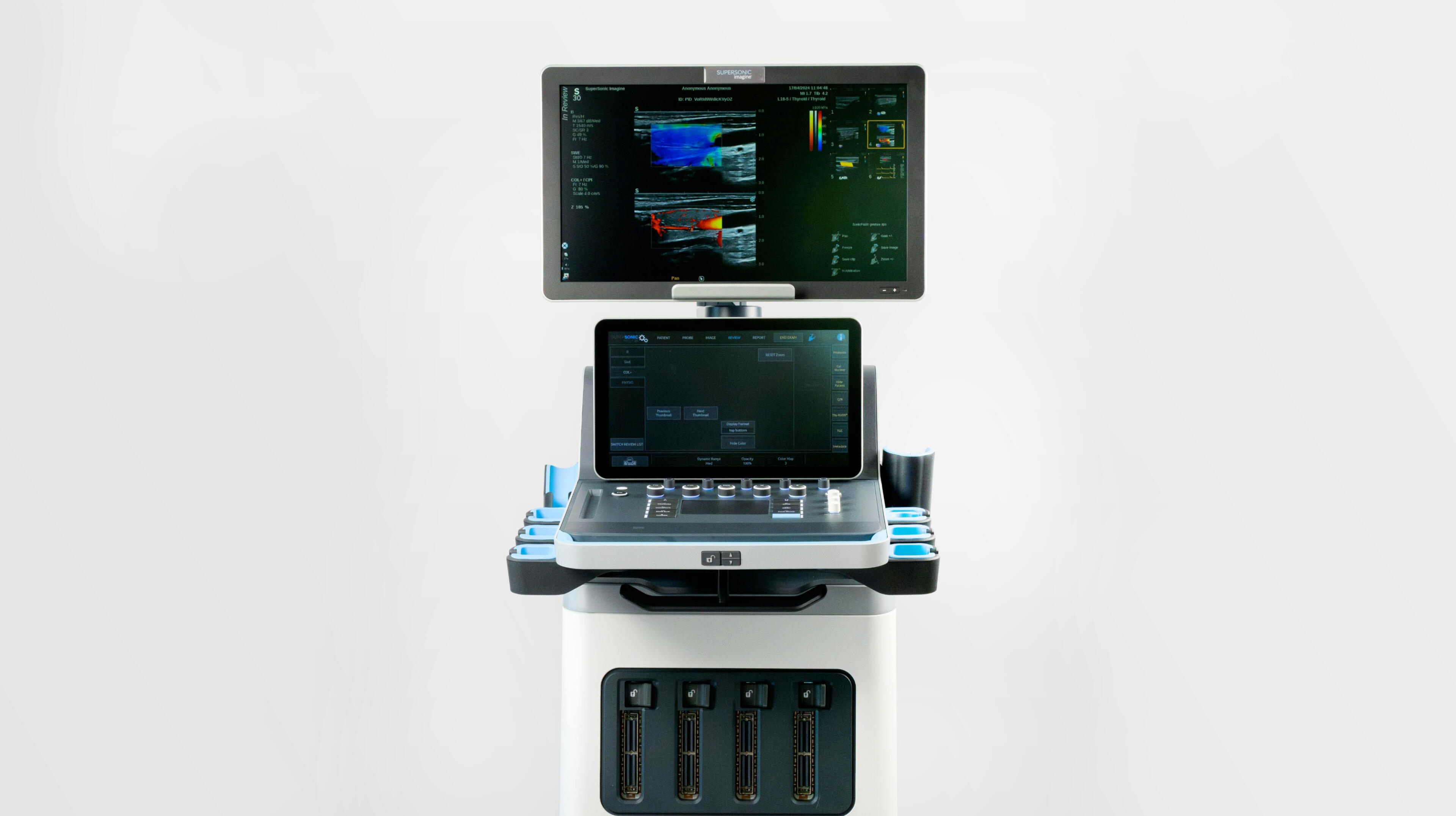
Physical and digital resolved as one: the trackpad, touchscreen, and console geometry were designed together so the interaction model reads as a single coherent system rather than layered components
DESIGN LANGUAGE
The final design language had to work at the scale of a clinical workstation while reading as considered rather than institutional. Proportion, surface finish, and the integration of the trackpad into the console geometry were resolved through the prototyping stage rather than set in advance which was the only way to make those decisions credibly at that scale.
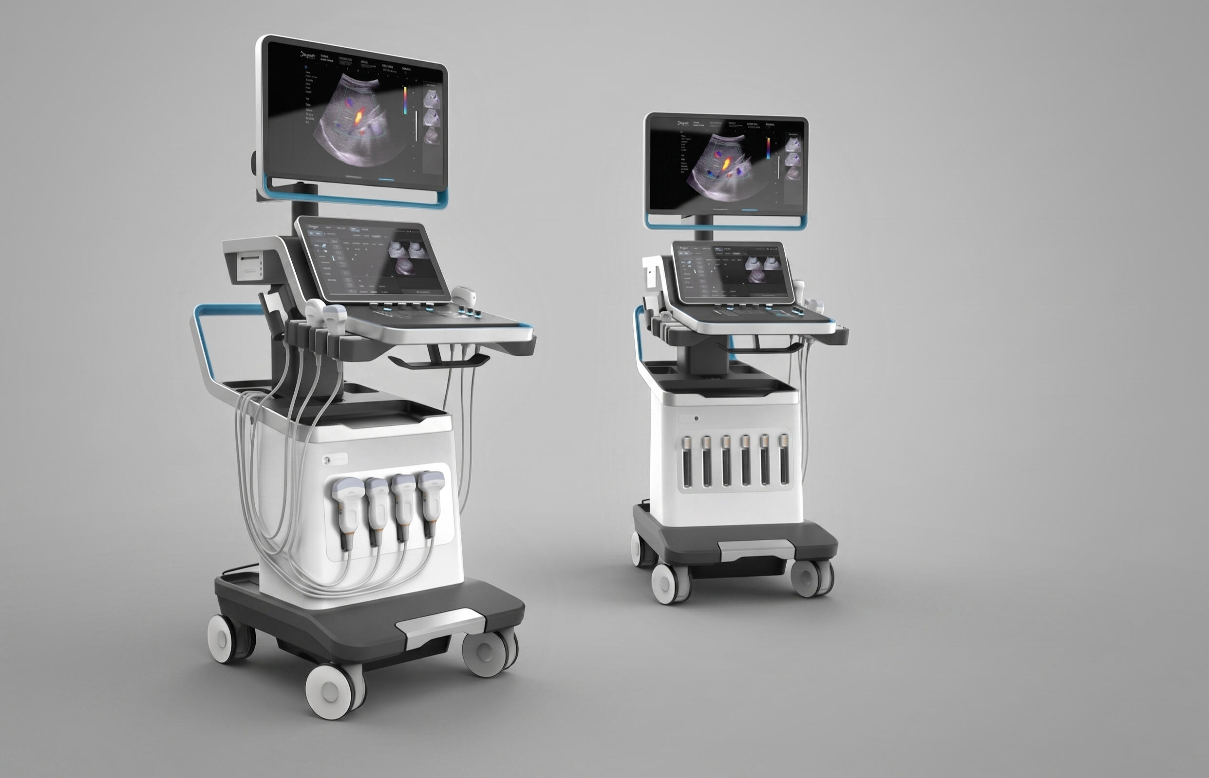
Production-oriented design language integrating hardware, software, and workflow considerations
CLINICAL VALIDATION
The design was validated against real clinical workflows rather than assumed ones. Participatory sessions with sonographers identified where the existing hardware created friction and informed how the new interaction model could be adopted without requiring retraining. That grounding in actual practice was held up in use.
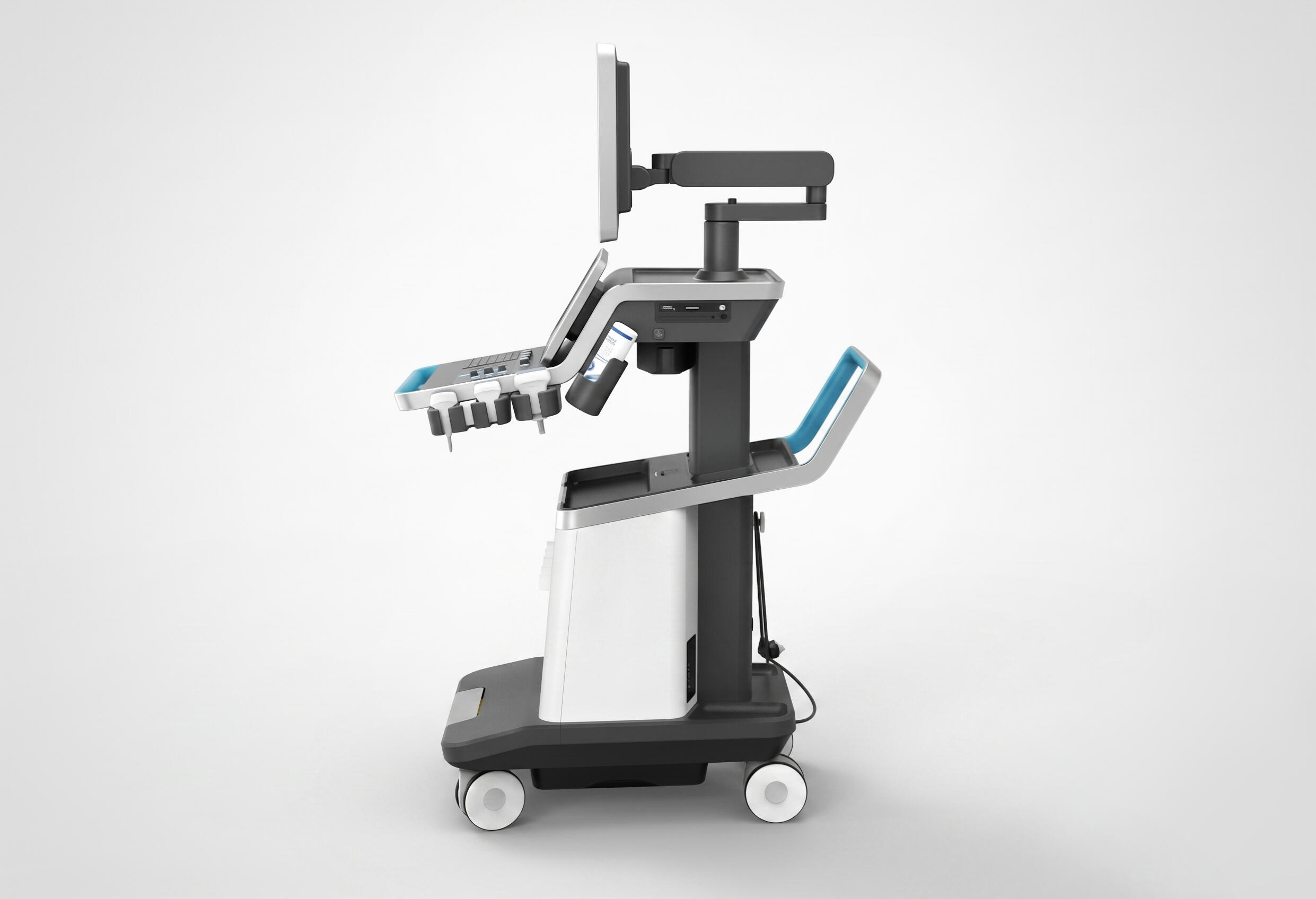
The probe holder integration was designed as part of the console architecture rather than an afterthought; probe placement, retrieval, and cable management are part of the workflow
KEY FOCUS AREAS
· Defining interaction opportunities within real ultrasound workflows, not assumed ones· Translating the multi-touch surface into a physical and interaction language that sonographers could adopt without retraining
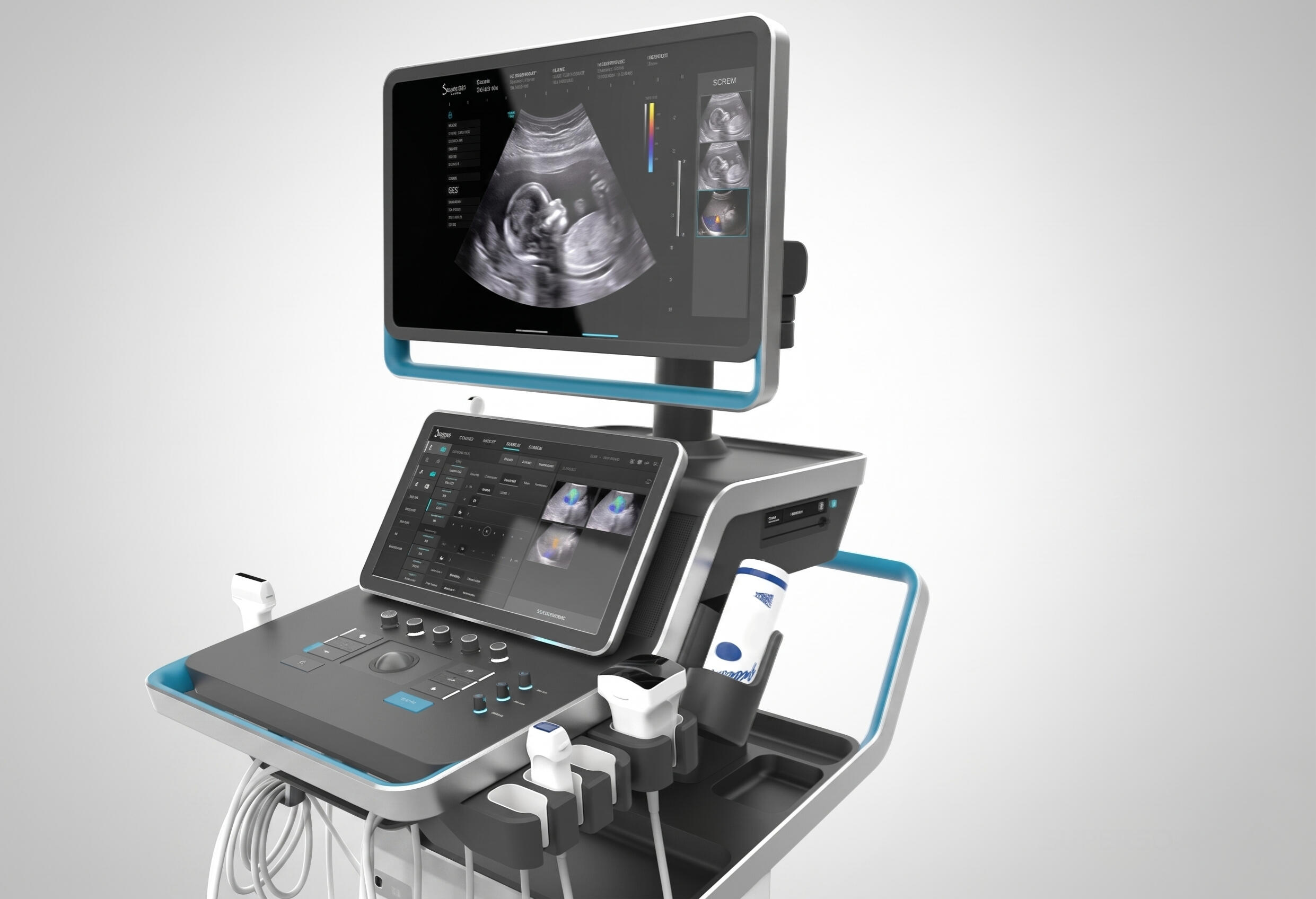
The Aixplorer Mach 30 was designed around a simple premise: the image is the interface. Everything else should recede until the clinician needs it
· Full-scale prototyping to validate ergonomics and multi-modal interactions at the scale of a clinical workstation· Working within international standards governing medical product development, which constrained both process and documentation at every stage
OUTCOME
The redesigned platform launched as the Aixplorer Mach 30 in 2018, introducing a new interaction model centred around a multi-touch control surface. The project demonstrated how user-centred design and iterative prototyping could modernise a highly specialised clinical workflow while supporting adoption in real-world healthcare environments.
ROLE
Industrial Designer as part of frog innovation team
FOCUS
Industrial Design · Human Factors · Product Architecture · Interaction Design
COMPANY
SuperSonic Imagine
IMPACT
Successful launch of the Aixplorer Mach 30 platform
AT1 Home Treadmill
ROLE
Freelance Industrial Designer
FOCUS
Industrial Design · Concept Design · Interaction Design
COMPANY
Aether
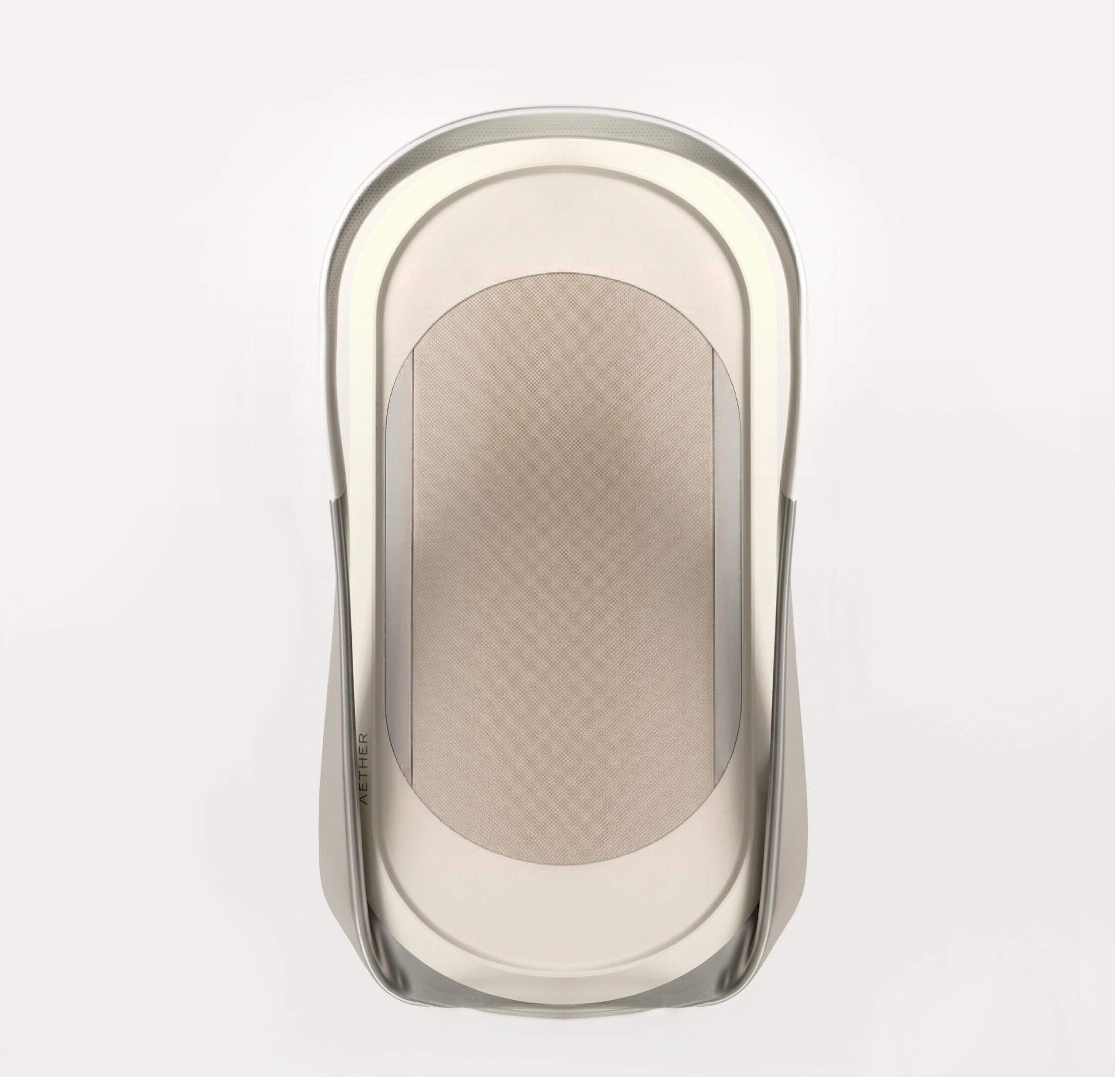
Aether AT1 is a smart treadmill concept that I designed as a freelance industrial designer for a client who approached me directly. The brief was to rethink what a home treadmill could be; both physically and in terms of how it interacts with the user during a workout.
PROBLEM CONTEXT
Treadmills are among the least considered objects in home fitness. They're large, visually heavy, and typically get folded away or hidden behind a door when not in use. At the same time, their interaction model is minimal: speed, incline, a timer. The hardware does very little to actually coach or correct the person using it.
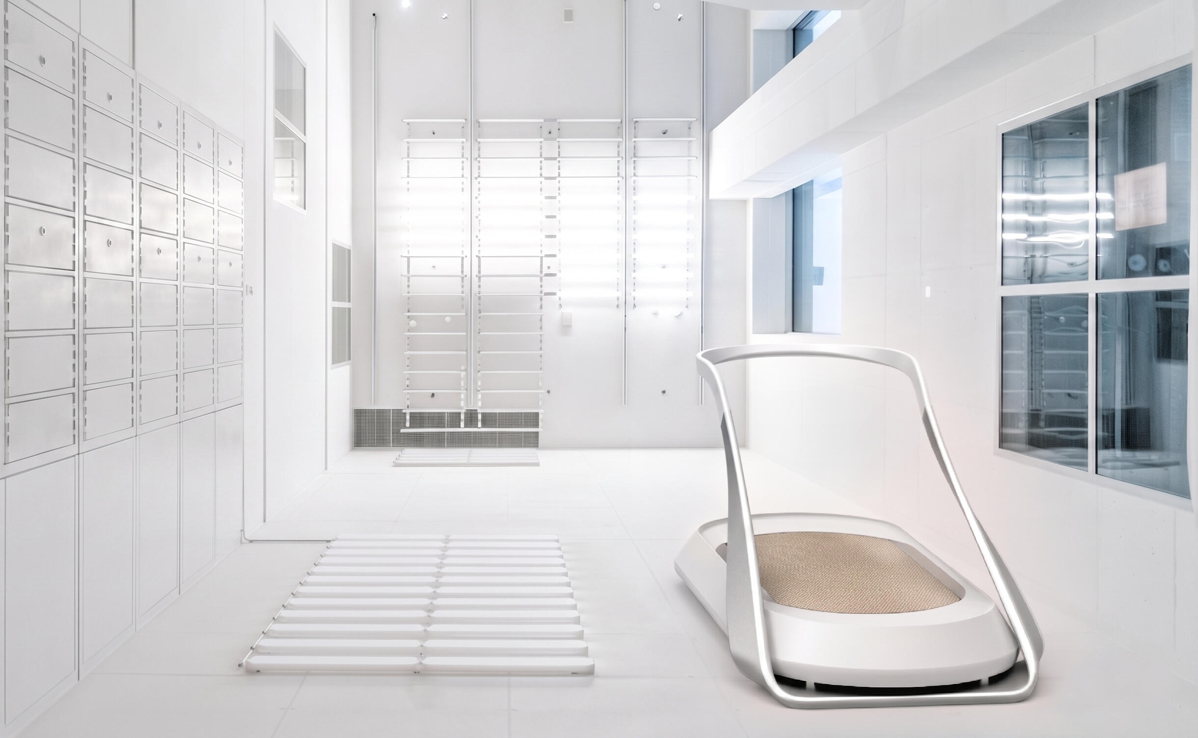
Image description
DESIGN GOAL
To design a treadmill that could reasonably live in a room without needing to be hidden, and that uses the belt as an active feedback surface rather than a passive running track. The concept centred on core strength: the running track is positioned centrally to encourage a 50:50 weight distribution, drawing on the same principle that makes a car's handling predictable. The handlebar, the display, and the on-step biometrics were all resolved within that same premise.
DESIGN PRINCIPLES
· Object could sit in a room without announcing itself. More like a furniture than a gym equipment
· Information when needed, nothing when not; the object should be visually silent at rest
· Domestic materials, not performance materials
KEY CONSTRAINTS
· Deck profile low enough to read as furniture at standing eye level
· Maintenance access without tools
· Minimal part count for assembly and cleaning
My role as industrial designer on the project, responsible for the full concept from first sketch to final presentation: form development, CMF, interaction model, and visual delivery. The brief was open enough that the design language, the handlebar architecture, and the furniture-first positioning were all decisions made within the project rather than handed down as constraints.
VISUAL INSPIRATION
The reference direction drew from high end futuristic objects and domestic artefacts rather than fitness equipment. The intent was to understand how objects earn the right to occupy a living space permanently; through form, proportion, and material restraint rather than how treadmills typically look. That reference frame defined the project before any form was drawn.
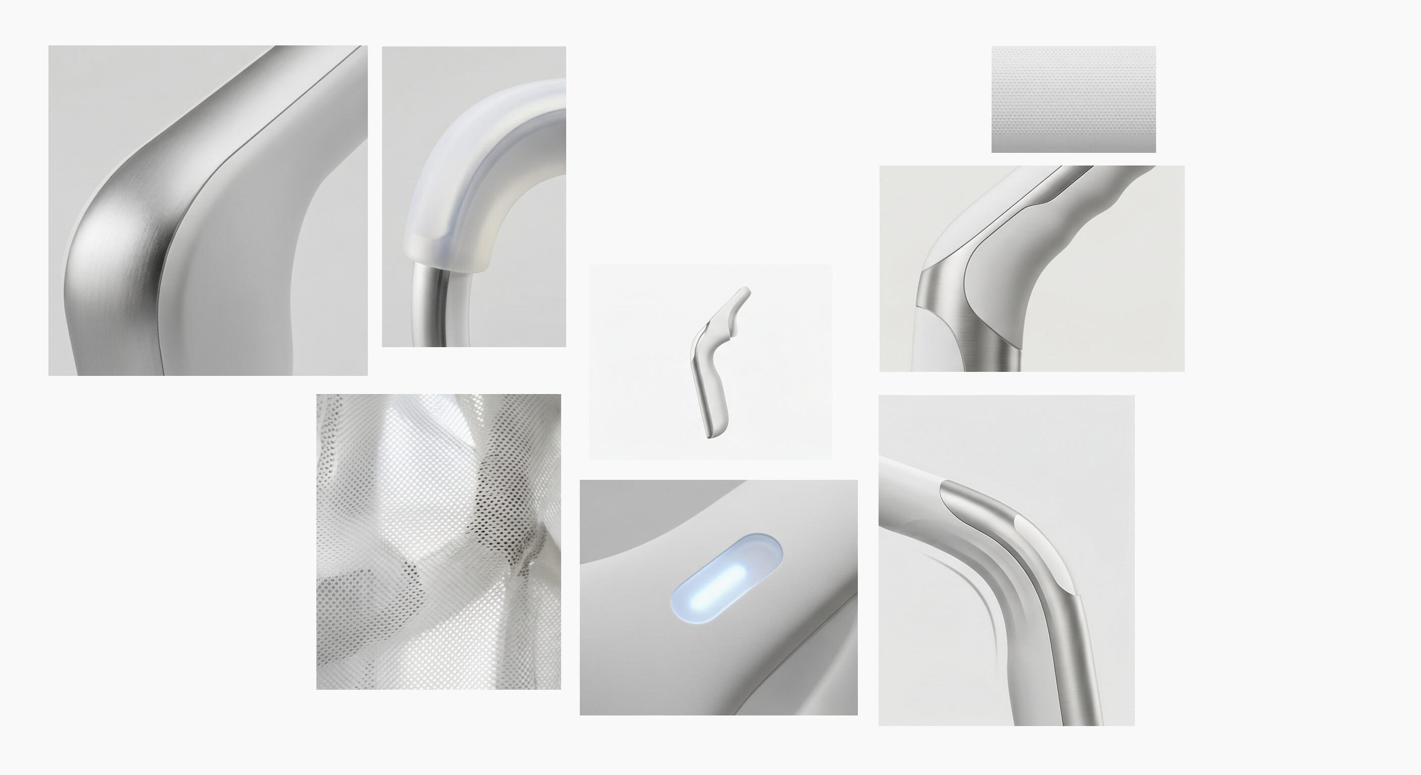
The moodboard established the refined, furniture-first positioning before any form was drawn
CONCEPT EXPLORATION
The early work was about establishing what kind of object the AT1 should be before resolving how it should look. Sketching explored a wide range of configurations, testing how the relationship between deck, handlebar, and display could be arranged to produce something that read as considered rather than functional.
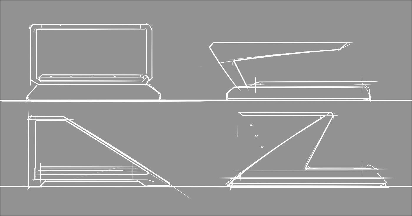
The sketch phase covered upright and low-profile configurations, different handlebar geometries, and various approaches to how the running surface related to the overall silhouette
CONCEPT DEVELOPMENT
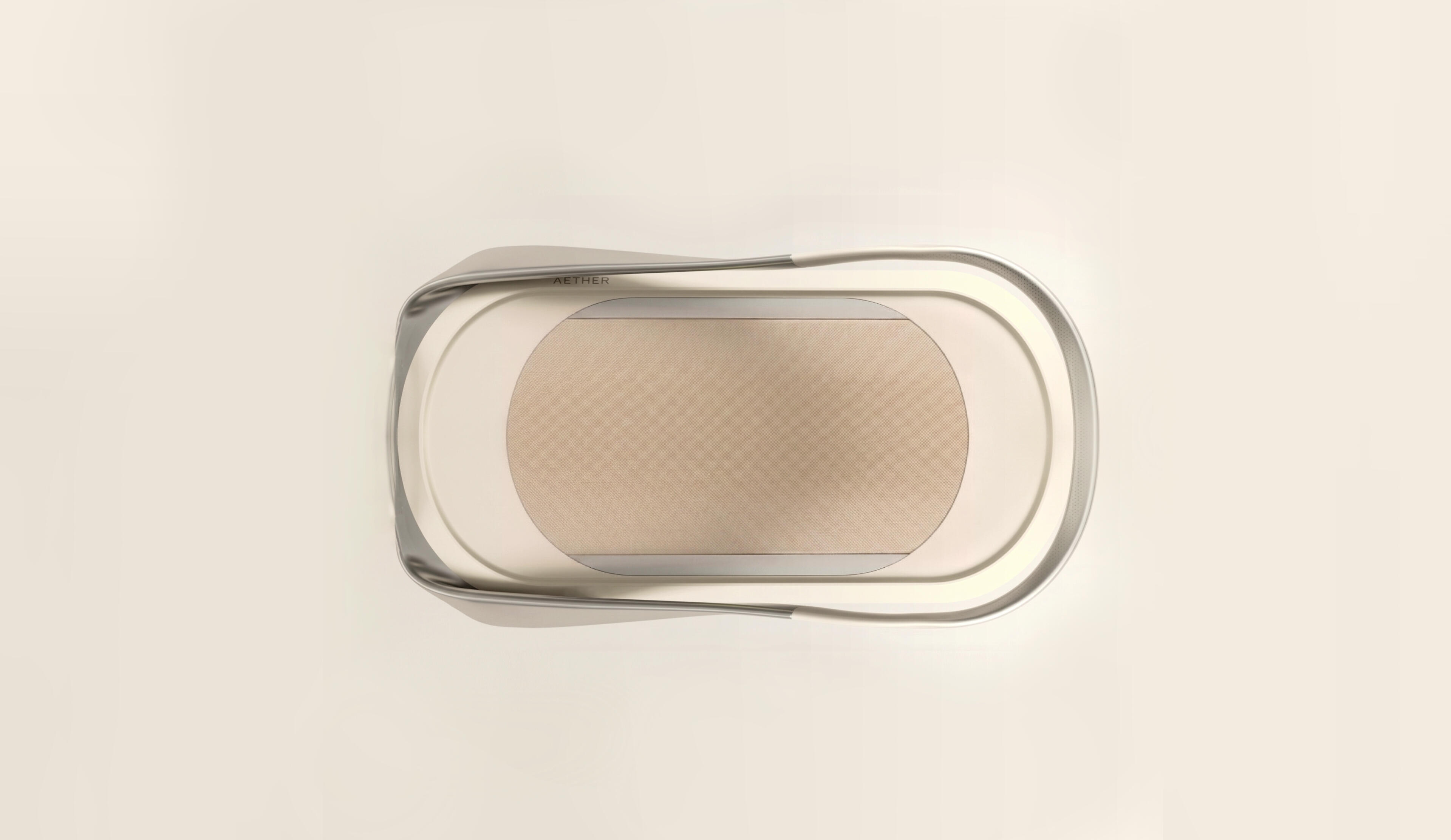
The deck profile is shallow enough that the belt surface reads as the dominant plane and the frame trim follows the full oval of the deck in a single unbroken line, giving the object a resolved edge. The arc handlebar rises from both ends of that frame and meets at a single bridge point overhead, so from above the whole object reads as one closed form; oval deck, arc, nothing interrupting either.
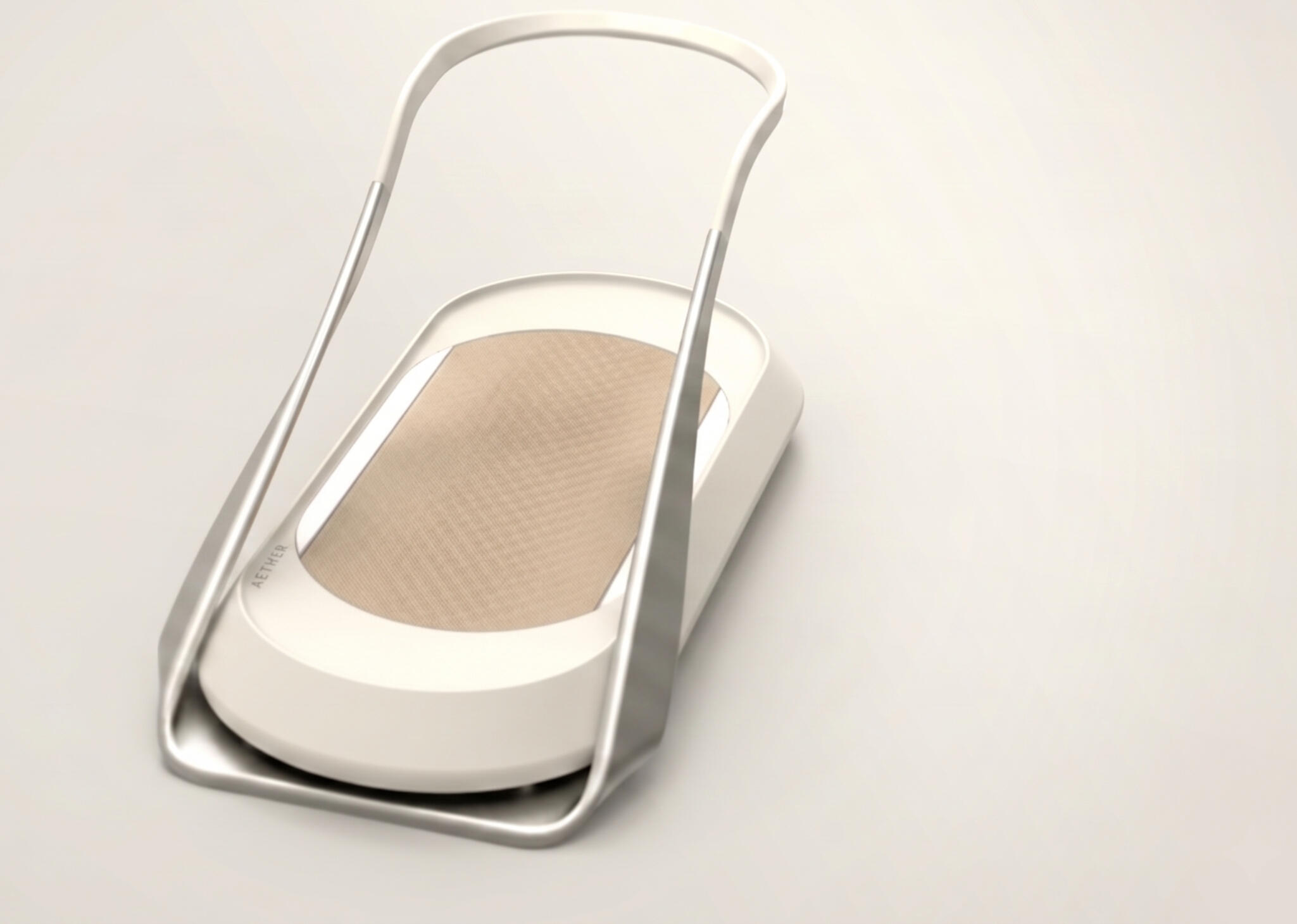
The arc handlebar emerged from that process as the defining move: a single looping form that frames the belt from above and reads as one continuous gesture
The proportional relationship between the deck width and the handlebar height keeps it from reading as tall or imposing. It sits low, the arc completes it, and the polished aluminum elements tie the object together without adding visual noise.
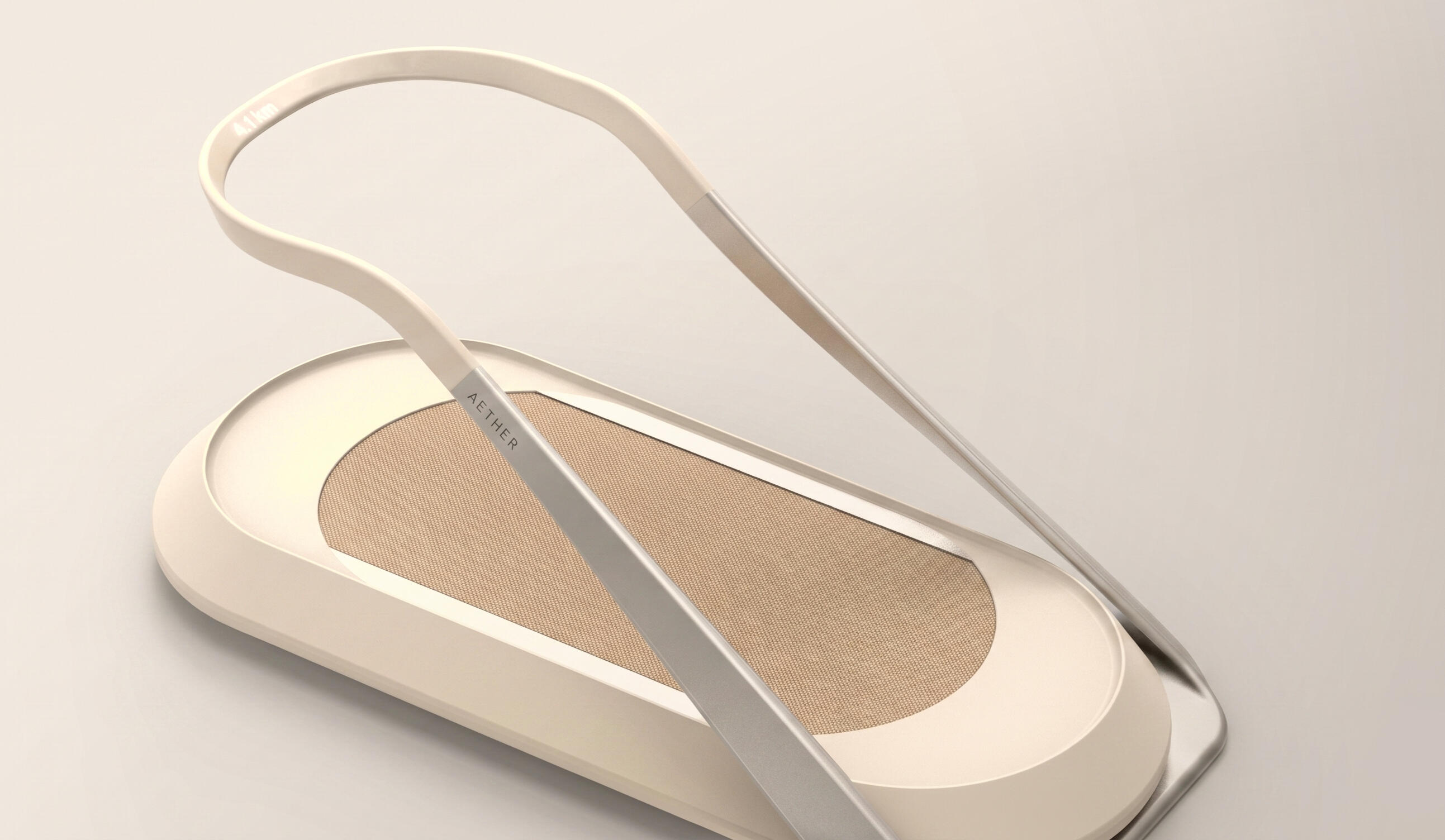
The dead front LED display was resolved into the handlebar bridge, keeping the object visually clean when not in use and surfacing information only during a session
CMF
CMF was directed around a single positioning decision: this is a piece of furniture that happens to be a treadmill, not a piece of gym equipment that has been styled. The deck housing is matte-painted ABS in bone white, warm enough to sit comfortably in a living space without asserting itself. The perimeter trim in polished aluminium extrusion is the only specular element on the object, and it carries most of the premium material work. The arc handlebar in hydroformed aluminium tube is polished to match the perimeter trim.
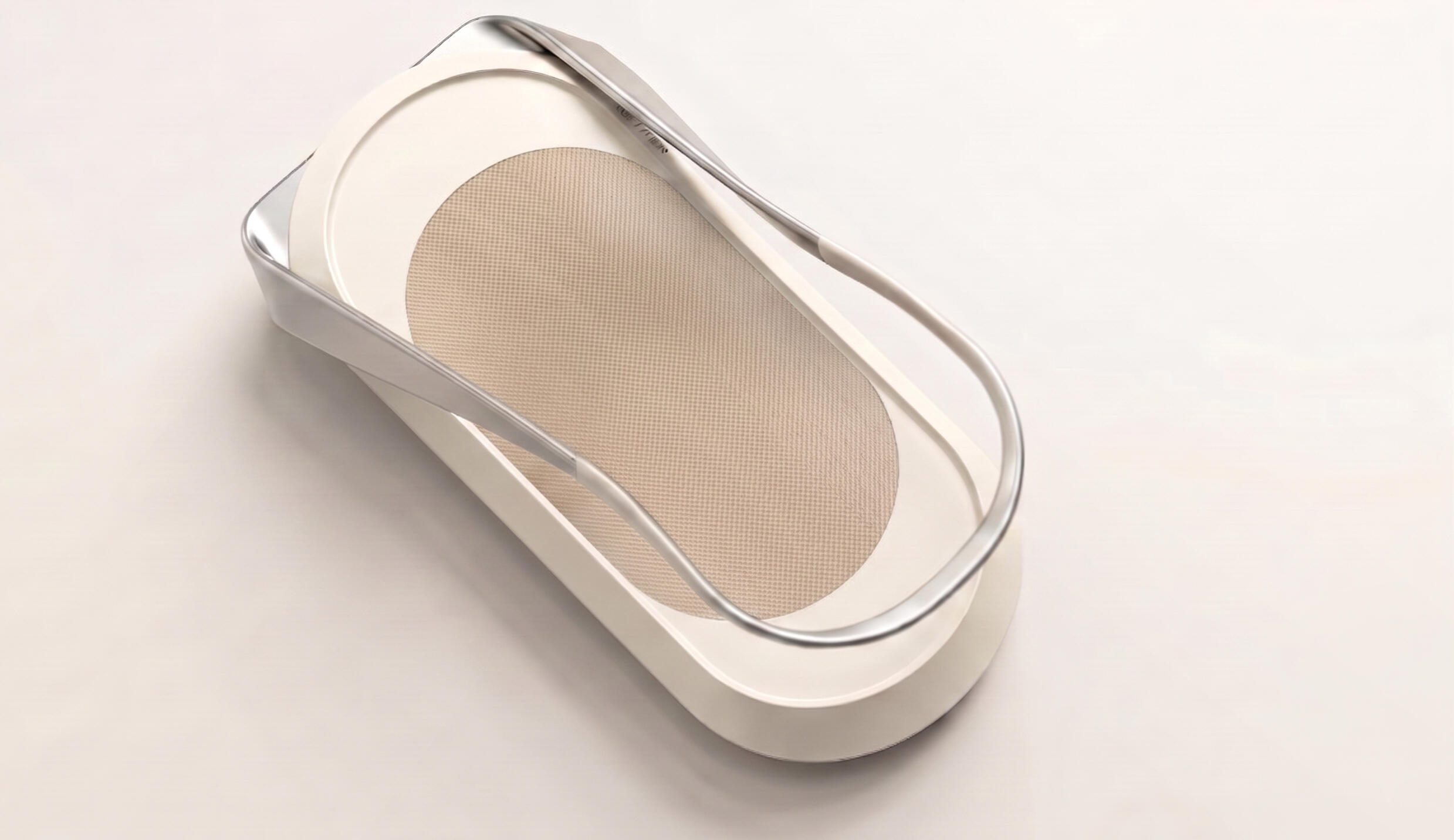
The running belt uses a woven textile top layer in natural sand, quieter underfoot than standard PVC and consistent with the domestic context the machine is designed for
KEY FOCUS AREAS
· Form, CMF, interaction model, and product positioning were all decisions made within the project· The domestic positioning was established early as the organising principle, not applied as a styling layer at the end
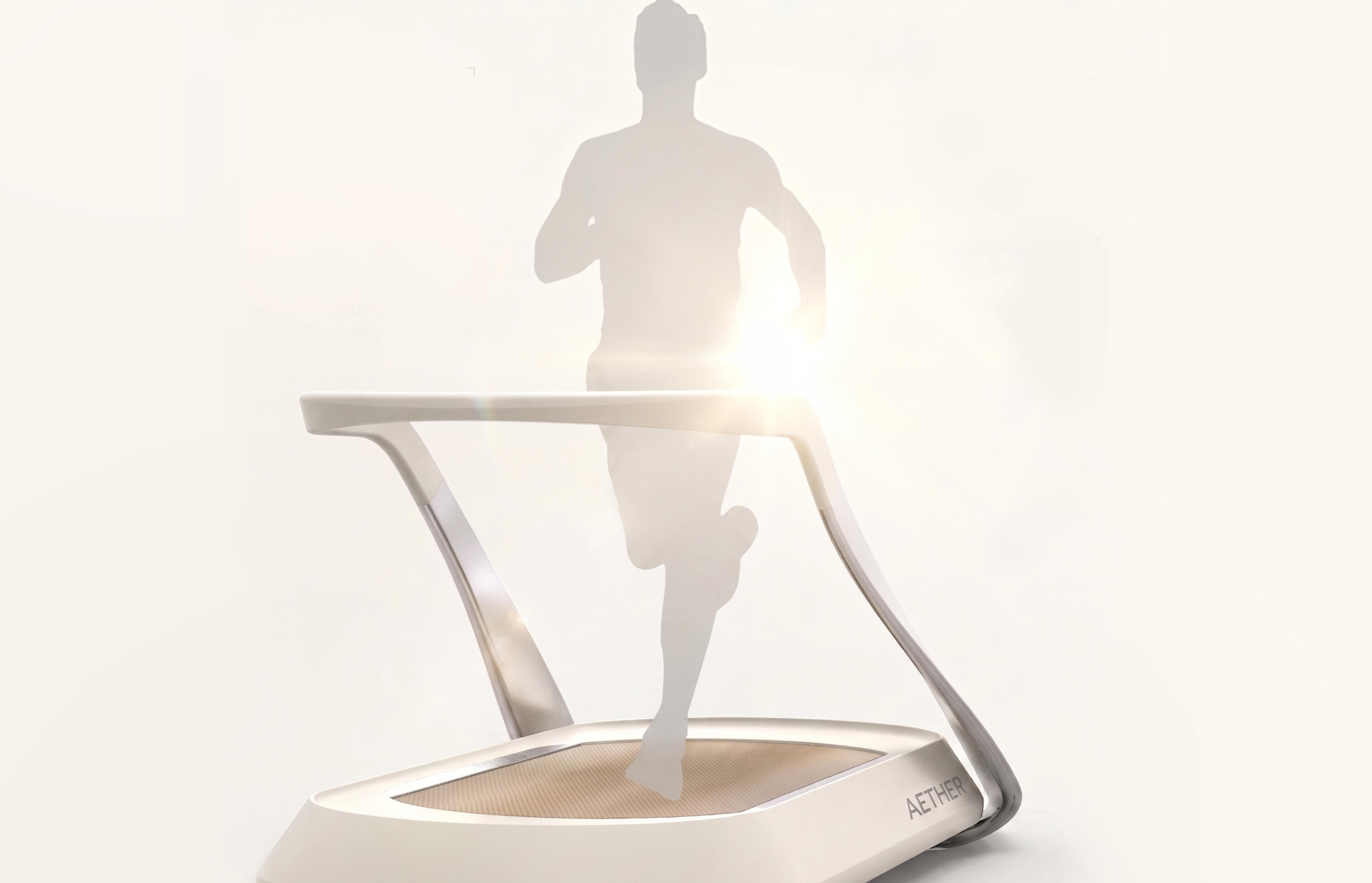
Ergonomics and usability led proportion, finish and handlebar geometry which is what kept the design coherent
· Proportion, finish, handlebar geometry, and colour from the start, which is what kept the design coherent across every detail decision· Designing a treadmill for a domestic environment is a different problem to designing gym equipment
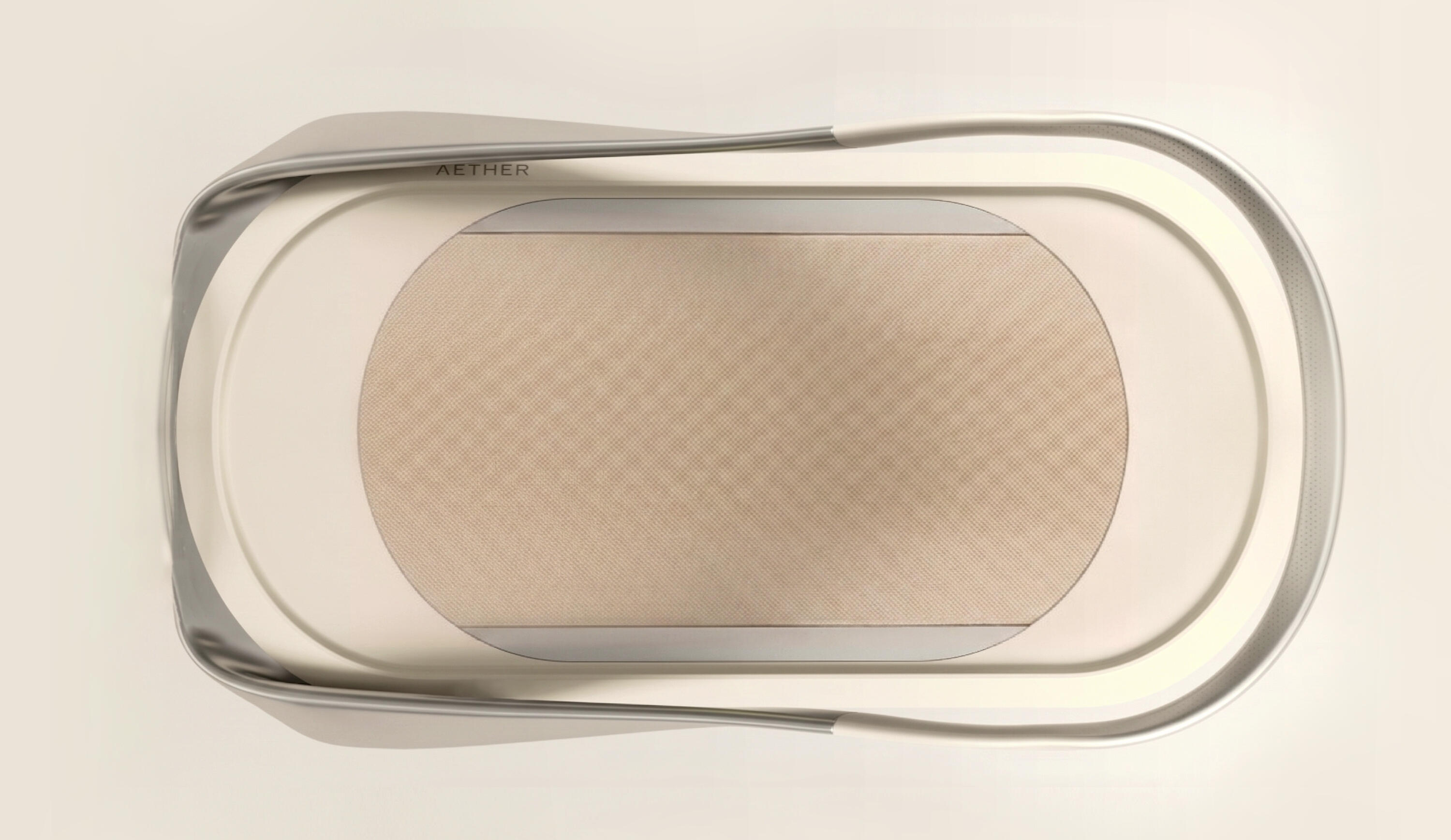
From above, the AT1 reads as a single resolved object, the polished pill-shaped trim, the textile belt, and the arc handlebar in one composition that doesn't look like gym equipment
OUTCOME
The AT1 was delivered as a full industrial design concept covering form, CMF, and interaction model. The client received a resolved design direction they could take into engineering and production development; which is the right handoff point for a project at this stage. As a freelance ID engagement, that was the scope, and the output reflected it.
ROLE
Freelance Industrial Designer
FOCUS
Industrial Design · Concept Design · Interaction Design
COMPANY
Aether
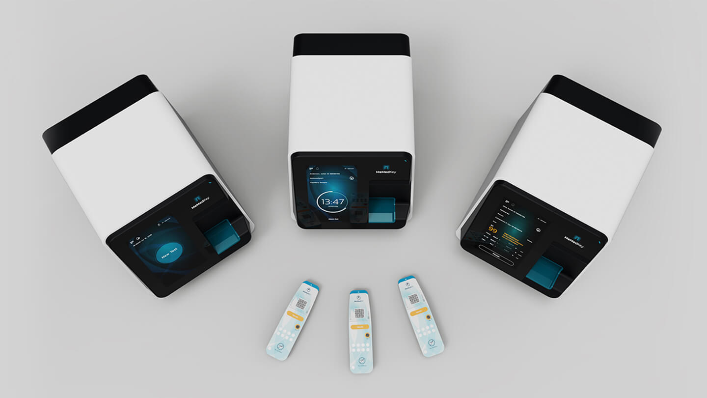
MeMed Key® Medical Scanner
ROLE
Industrial Designer as part of frog innovation team
FOCUS
Industrial Design · Medical Device Design · CMF · Prototyping
COMPANY
MeMed
IMPACT
Red Dot Award for Product Design
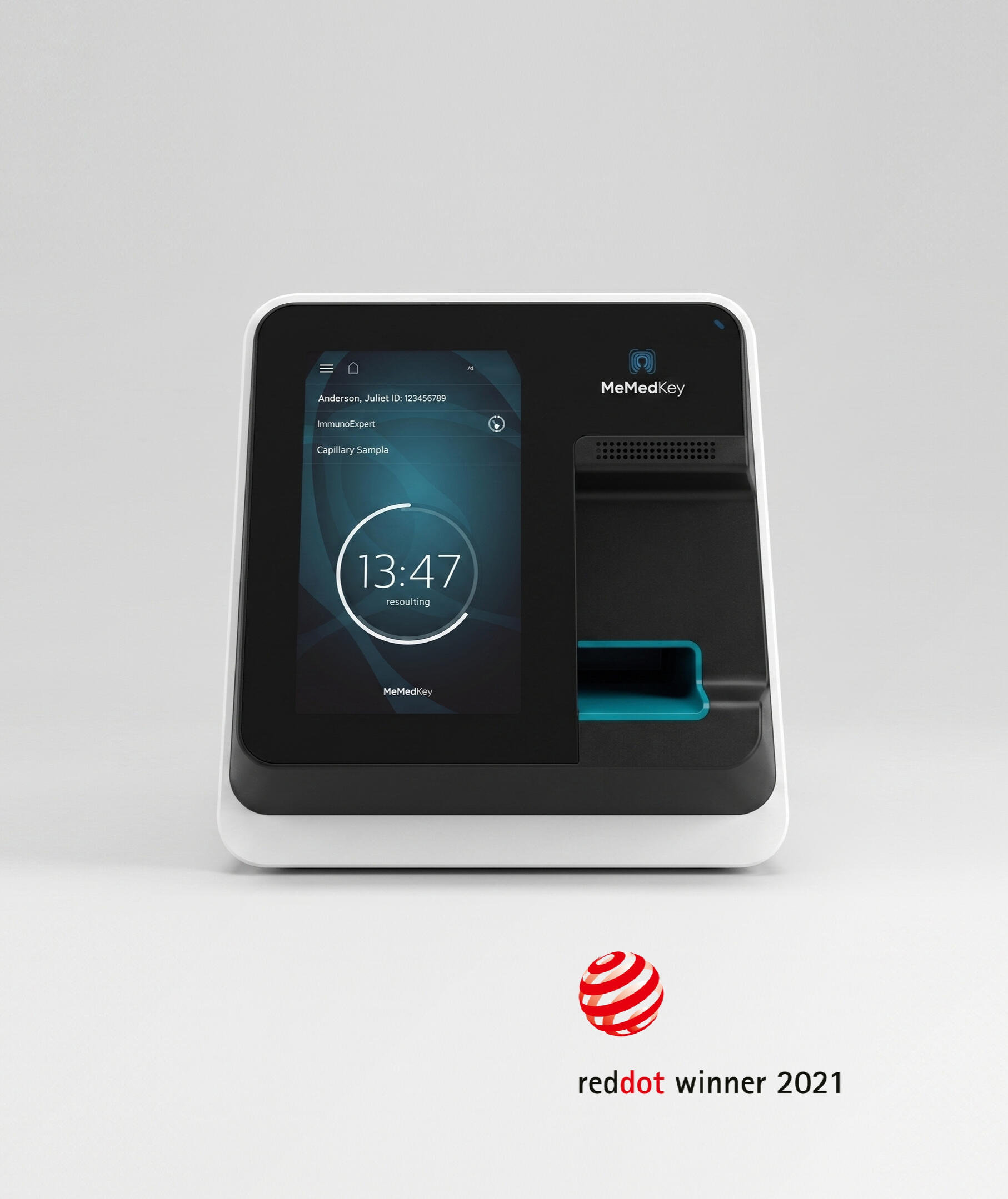
MeMed Key® is a point-of-care diagnostic device that can distinguish between bacterial and viral infections from a blood sample in 15 minutes. The project addressed a real clinical problem: antibiotic overprescription driven partly by the absence of fast, accessible diagnostic tools outside of central labs. My focus was the device itself, designed around a disposable cartridge system that was already defined as a technical given.
PROBLEM CONTEXT
Point-of-care diagnostics carry a specific set of physical constraints that lab equipment doesn't. The device needs to work reliably in GP offices, urgent care facilities, and nursing homes, operated by people who aren't lab technicians, under time pressure, in variable conditions. The MeMed Key® also had to integrate a self-sealing cartridge that automatically opens and closes inside the device during operation, which meant the internal architecture was largely predetermined.
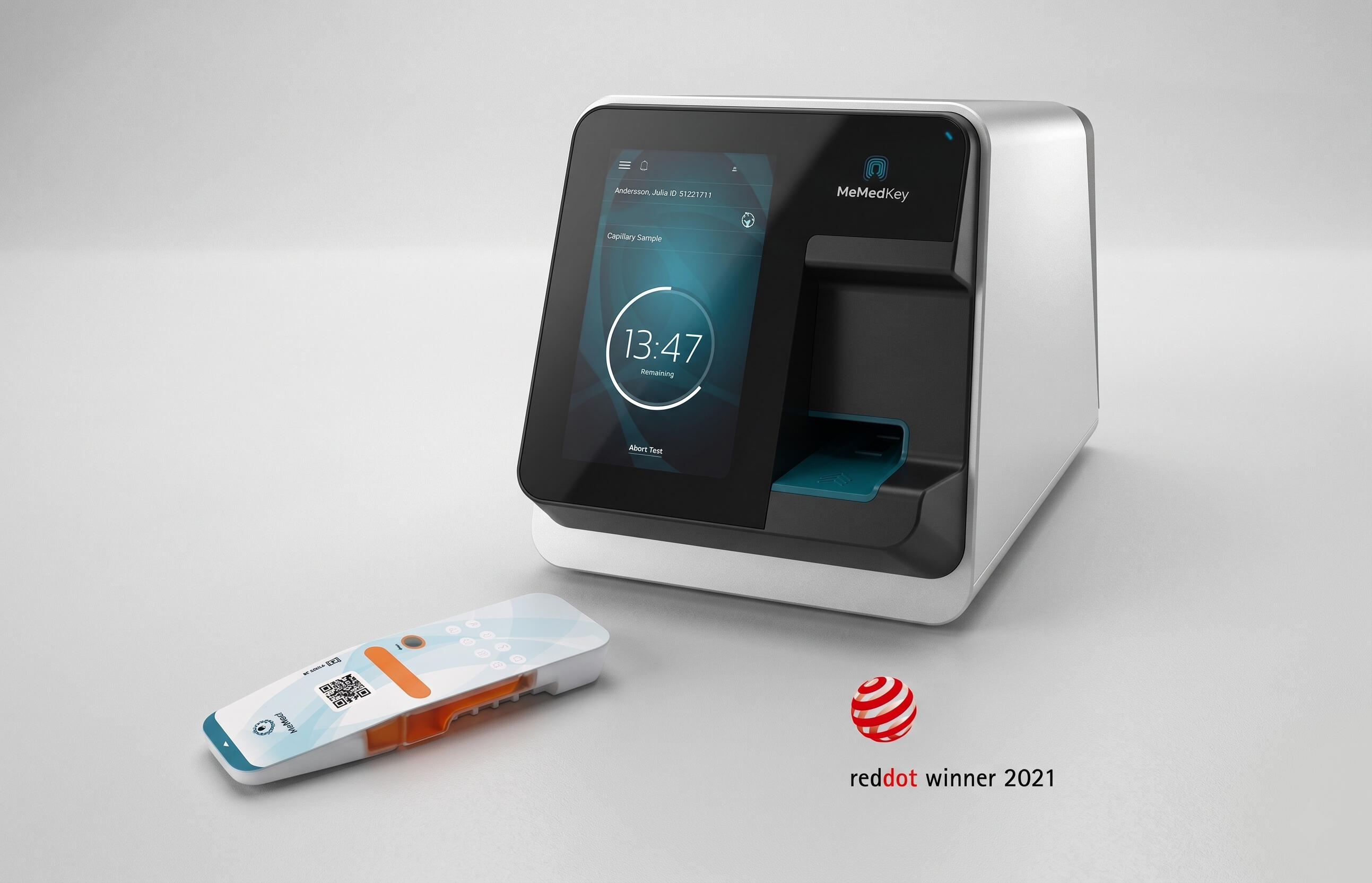
The device addresses a specific gap: a rapid diagnostic that can distinguish bacterial from viral infection outside a central lab, in the environments where that decision gets made
DESIGN GOAL
The design goal was to build a credible, functional product around the mechanical constraints without letting them show. To design a device that reads as precise and trustworthy in a clinical setting, is operable without specialist training, and physically accommodates the cartridge mechanics without the housing feeling like an afterthought to the engineering inside it.
DESIGN PRINCIPLES
· Make mechanical constraints invisible
· Credibility without intimidation
· Operable without training
· System coherence between the physical device and the digital interface
KEY CONSTRAINTS
· Self-sealing cartridge mechanism
· Device can be operated by non-specialists under time pressure
· Cartridge insertion had to be reliable and repeatable as a one-handed gesture
· CE Mark certification requirements constrain materials and surface finishes
My role as a part of the frog industrial design team ran across concept development, physical modelling, and refinement toward a resolved design. The work ran in parallel with the client's engineering team and the cartridge architecture and the device form were developed together.
APPEARANCE MODELLING
Appearance models were built to validate how the device read and handled in context; how it sat on a counter, how it was handled, how the cartridge insertion felt in practice. The interface usability and workflow was also tested; ie whether the cartridge slot, the display, and the status indicators worked and read correctly and accessibly.
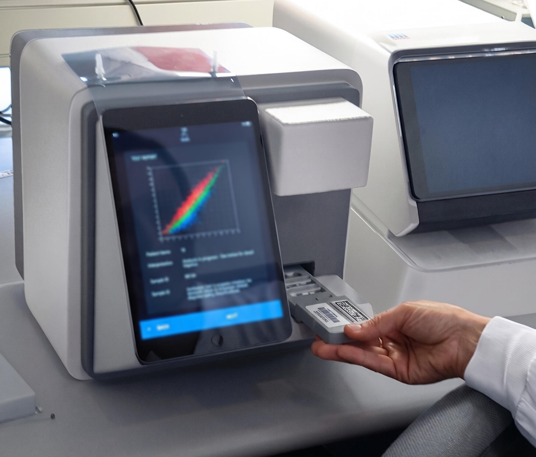
Appearance models validated how the device read at actual scale; proportion, grip, and cartridge insertion tested in context before the form was finalized
PRODUCT ARCHITECTURE
The cartridge architecture was developed alongside the device form rather than handed over as a fixed constraint from the start; which meant the design process involved a genuine back-and-forth with the client on how the internal system and the external housing could inform each other. That kind of collaboration is slower but produces a more integrated result.
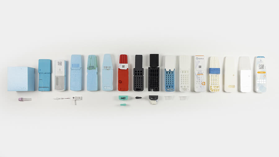
The self-sealing cartridge mechanism defined much of the internal volume before the housing design began
INTERACTION DESIGN
The work also ran alongside frog's visual design team, integrating the UI and interaction model into the same design language so that the physical device and the software experience read as a single coherent system rather than two workstreams that were reconciled at the end.
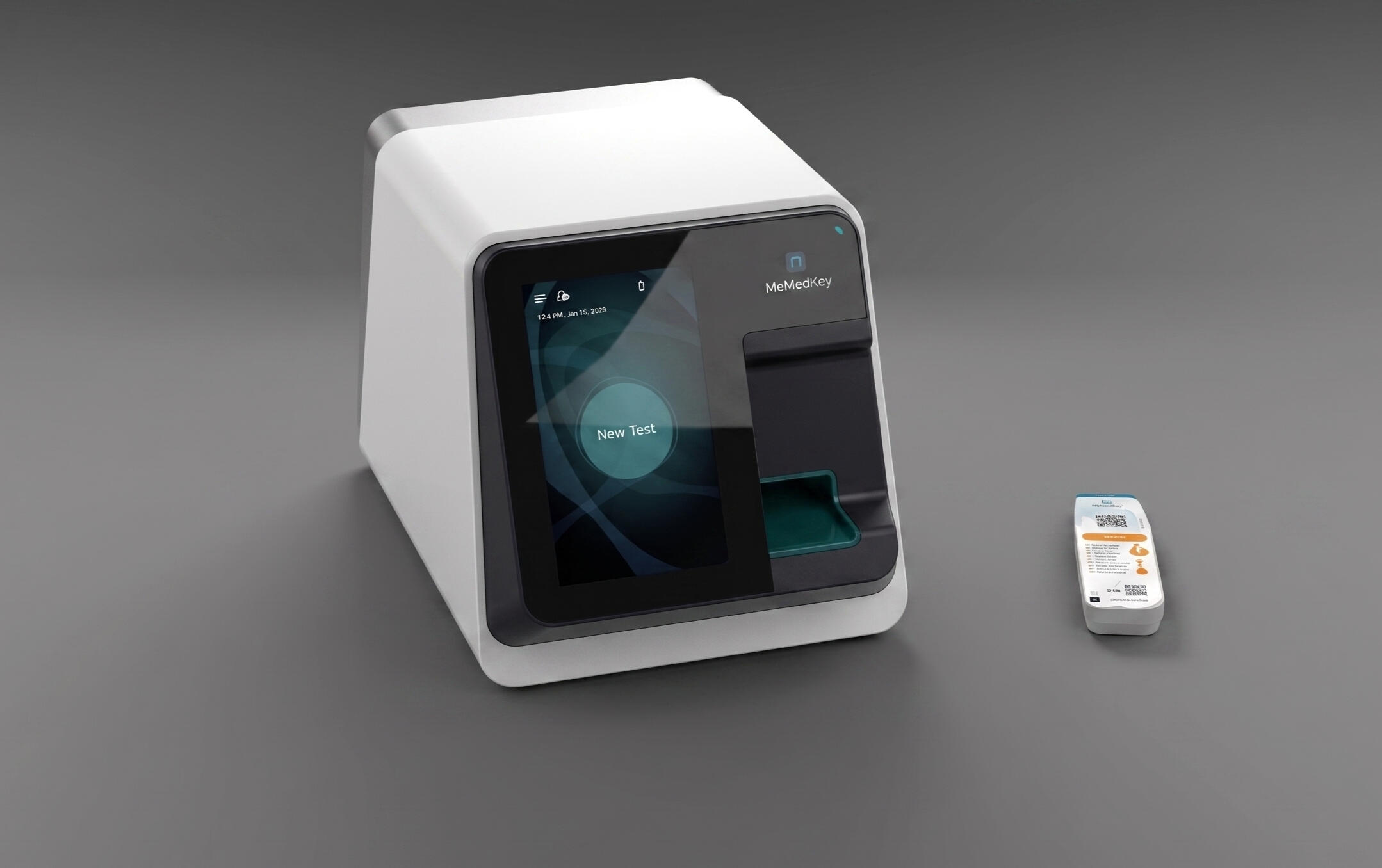
The physical device and the digital interface were developed in parallel with our visual design team
DESIGN LANGUAGE
The physical language of the device had to communicate precision and clinical credibility without the visual register of a hospital device. The form needed to belong in clinical setting but not a lab. That balance shaped every surface and material decision, from the housing finish to the proportions of the cartridge slot.
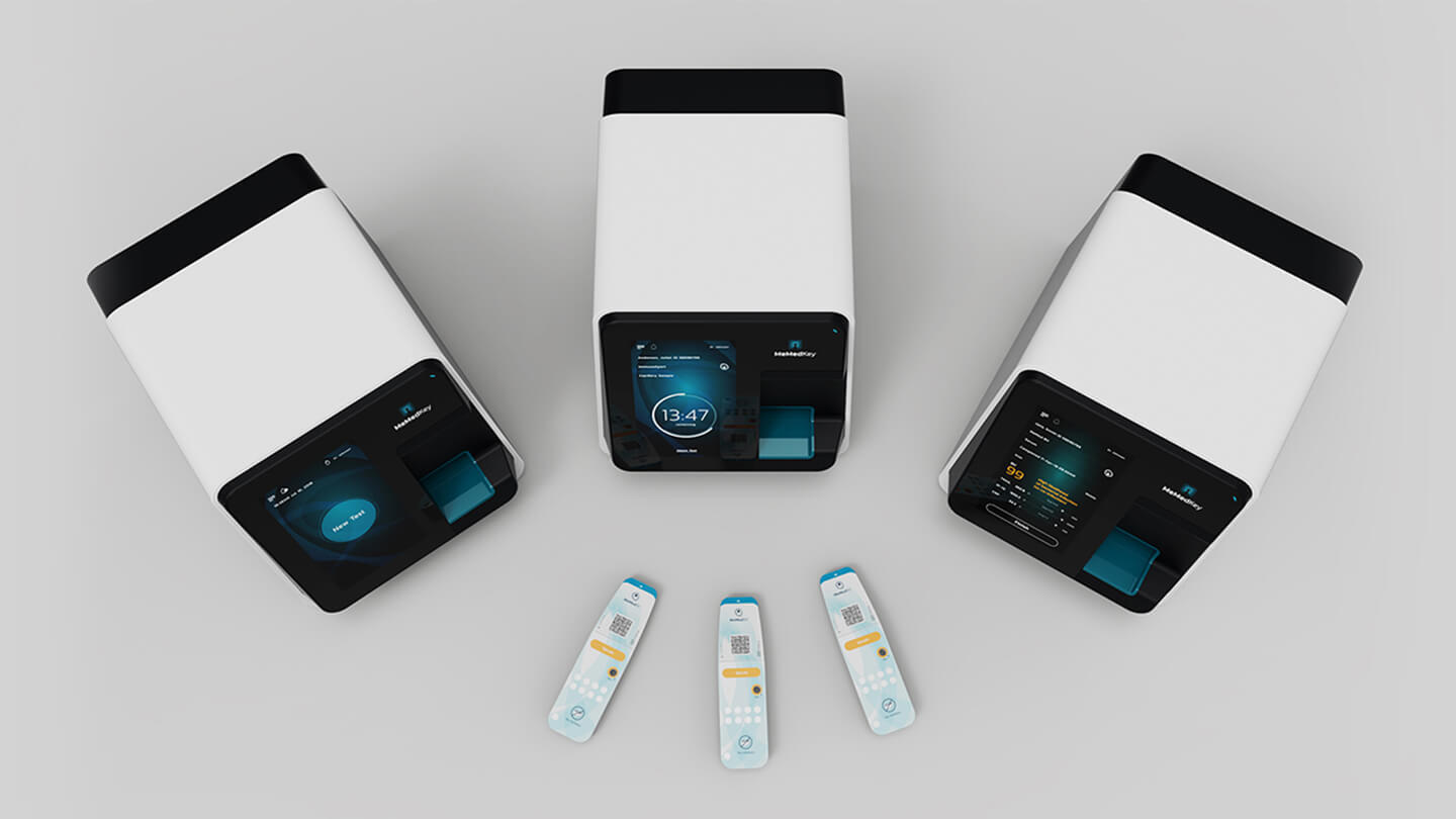
The form communicates precision and clinical credibility without feeling intimidating or out of place in a primary care setting
KEY FOCUS AREAS
· Designing the housing around a predetermined internal architecture; the self-sealing cartridge mechanism defined the internal volume and access geometry before the ID work began, so the design task was building a form that felt resolved on its own terms rather than shaped by what it was enclosing· Ergonomics and interface clarity for users who are not lab technicians: GP practice nurses, urgent care staff, and nursing home personnel operating the device infrequently, under time pressure, without specialist training
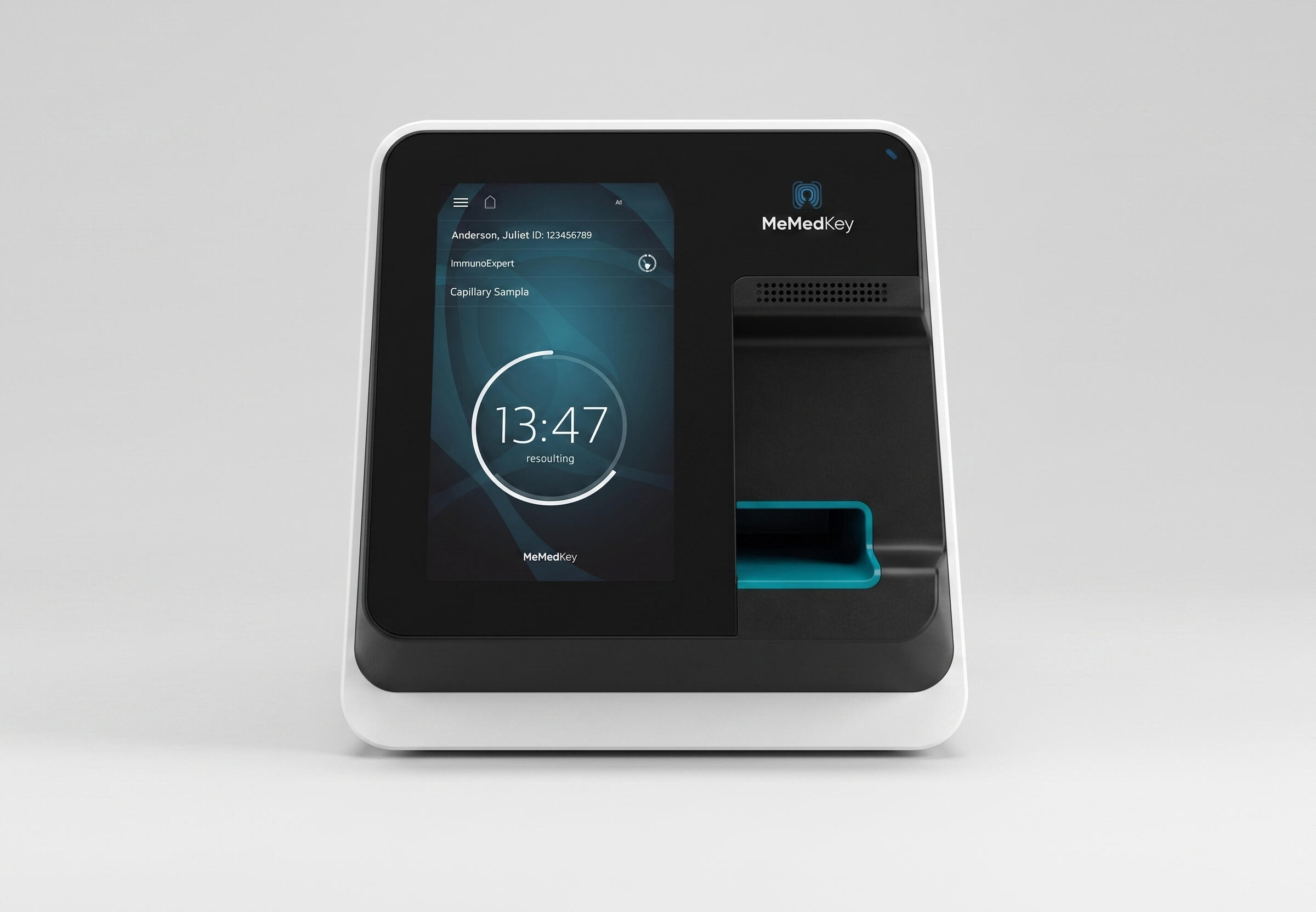
The device received the Red Dot Award for Product Design and CE Mark certification
· Physical language that communicates precision and clinical credibility without tipping into the kind of visual register that feels intimidating or out of place in a primary care setting; the device needed to belong in a GP office, not a hospital lab· Appearance modelling and physical prototyping to validate how the device reads and handles in context, testing decisions about proportion, grip, and cartridge insertion that CAD alone cannot resolve at the scale of a handled medical device
The full diagnostic sequence in 15 minutes: cartridge inserted, self-sealing mechanism engages, scan runs, result displayed. A workflow designed to be completed by a non-specialist without instruction and a physical design making every step of that easy and self-evident
OUTCOME
The MeMed Key® received the Red Dot Award for Product Design and CE Mark certification, positioning it for healthcare markets across Europe. frog was awarded several patents covering architecture and design elements developed during the project. It's now in active clinical use as one of the more practical tools available for reducing unnecessary antibiotic prescriptions at the point of care.
ROLE
Industrial Designer as part of frog innovation team
FOCUS
Industrial Design · Medical Device Design · CMF · Prototyping
COMPANY
MeMed
IMPACT
Red Dot Award for Product Design
Aleks Baser (b.1990, Kadikoy) is an industrial product designer and furniture designer based in Berlin.He studied industrial design at Domus Academy, and interior design at Università Marconi. He has collaborated with global brands and worked at design studios in Milan including frog, personally winning the A’ Design Award and contributing to team projects that earned the Red Dot Award.Today, he pursues projects that blend design, craft, and everyday human experience.For collaborations, commissions and inquiries: [email protected]